Tabs versus ActionPanel
Starting in the 2.8 release, the PropertiesDialog by default now uses the new ActionPanel component for navigation, instead of a tab pane. This is a significant change in the user interface, and may affect how you decide to lay out your properties.
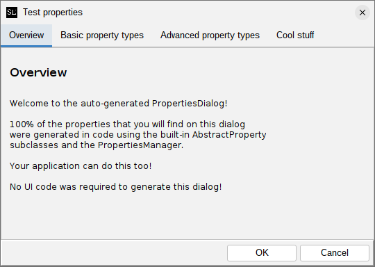
The "classic" style (tabbed pane)
This style is still available, via the createClassicDialog() method in PropertiesDialog, or via
the generateClassicDialog() wrapper method in PropertiesManager. It looks like this:
If your application uses the application extension mechanism provided by swing-extras, you will have
to override the showPropertiesDialog() method in your AppProperties implementing class, and
invoke generateClassicDialog() instead of generateDialog(), to get this style of dialog.
The new ActionPanel style
The new default style uses the ActionPanel component for navigation, and looks like this:
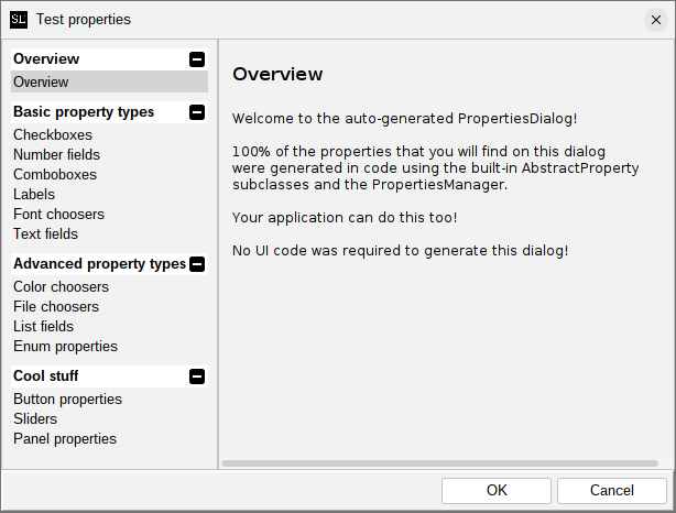
This groups actions into action groups, which are expandable and collapsible, in the left-hand pane. Clicking a property group will show the properties in that group on the right side. This new style is better suited for applications that have larger numbers of properties, and/or more properties supplied by extensions, as it allows for better organization and easier navigation. It also provides a large number of customization and styling options.
Customizing the generated dialog
If you are using AppProperties in your application, you can override the propertiesDialogCreated() method
to get a chance to inspect and modify the generated dialog after it is created but before it is shown.
For example:
@Override
protected void propertiesDialogCreated(PropertiesDialog dialog) {
    // We can customize the ActionPanel!
    if (dialog instanceof ActionPanelPropertiesDialog actionPanelDialog) {
        ActionPanel actionPanel = actionPanelDialog.getActionPanel();

        // There are many options here!
        // Refer to the ActionPanel documentation for details.
        actionPanel.getColorOptions().setFromTheme(ColorTheme.MATRIX);
    }
}