What is this?
swing-extras is a collection of custom components and utilities for Java Swing applications,
to allow developers to very quickly and easily stand up powerful applications with rich UI features.
This documentation guide covers the possibilities that swing-extras offers that allow you to
quickly and easily add useful functionality to your Java Swing applications.
This guide covers version 2.8.0 of swing-extras from 2026-03-08
The library jar includes a built-in demo application that offers a brief preview of some of the features and
components of swing-extras:

Getting started
Option 1: use the Maven archetype to create a new project
There is a swing-extras Maven archetype in Maven Central that you can use to very quickly bootstrap a new Java Swing project that uses swing-extras. Many key components are provided out of the box, and comments are provided to guide you in customizing and extending the generated project. To use the archetype, run the following command:
mvn archetype:generate \
  -DarchetypeGroupId=ca.corbett \
  -DarchetypeArtifactId=swing-extras-archetype \
  -DarchetypeVersion=2.8.0 \
  -DgroupId=com.example \
  -DartifactId=my-app \
  -Dversion=1.0.0 \
  -DartifactNamePascalCase=MyApp
Just set the groupId, artifactId, version, and artifactNamePascalCase properties appropriately for your application.
Always use the latest version of the archetype! 2.8.0 is the latest version at the time of this writing, but
check Maven Central for newer versions.
The generated application includes many comments explaining what features were provided for you, and how/where
to add customizations for your application. This is the easiest way to get started with swing-extras!
Option 2: Add swing-extras as a dependency in your existing Maven project
swing-extras is available in Maven Central, so you can simply list it as a dependency in your Maven pom.xml and
then start building swing-extras features and components into your Swing application!
<dependencies>
  <dependency>
    <groupId>ca.corbett</groupId>
    <artifactId>swing-extras</artifactId>
    <version>2.8.0</version>
  </dependency>
</dependencies>
Option 3: Clone the repo and build locally
If you want to run the demo app, or if you just want to play with the code locally, then you can clone the repo:
git clone https://github.com/scorbo2/swing-extras.git
cd swing-extras
mvn package

# Run the built-in demo app:
java -jar target/swing-extras-2.8.0-jar-with-dependencies.jar
Updates, issues, and more information
At the time of this writing, 2.8.0 is the latest version. Use the following links for more information:
- swing-extras on GitHub
- Use the GitHub issues page to report bugs or request features.
- Browse the Javadocs online
- Version history and release notes
- Release announcement archive
License
swing-extras is made available under the MIT license. This means that you can do as you wish with the source code, provided the copyright notices remain intact:
Copyright © 2012-2026 Steve Corbett
Have fun with it!
Suggestions and bug reports
Bug reports and feature requests are submitted via GitHub issues. Feel free to create a ticket there!
swing-forms
The swing-forms library allows developers to very quickly and easily lay out
forms without having to write manual layout code with GridBagLayout and
GridBagConstraints. Most commonly-used UI components are wrapped in
swing-forms, allowing you to simply instantiate them and add them to
a FormPanel, with configurable validation and optional form actions.
Almost all swing-forms classes are extensible by design, allowing you to
quickly build your own custom form fields if the built-in form fields don't
meet your needs.
What can I do with swing-forms?
The swing-forms library wraps most of the common input components into easy-to-use
wrapper classes and hides much of the complexity of using them. Included example
form field implementations are:
- Checkbox
- Color picker (with support for solid colors and for color gradients)
- Combo box (editable and non-editable variants)
- File chooser (with optional image preview panel)
- Directory chooser
- Static label fields
- Number pickers (spinners)
- Text input fields (single-line and multiline supported)
- Password input fields
- Multi-select list fields
- ImageList fields, with drag-and-drop support for adding images
- Panel fields (for rendering custom stuff)
In the next few sections, we'll take a tour of the features provided by swing-forms, and we
will be making use of these features in most of the rest of this documentation, because many
of the other features included in swing-extras build on top of swing-forms.
Brief history
swing-forms was originally developed and distributed as a separate library, but because of the
large overlap between swing-form and swing-extras, the decision was made to absorb all of
swing-forms into swing-extras as of the 2.0 release in April 2025.
swing-forms: the basics

Most of the common Swing components are wrapped in swing-forms so that you can very quickly stand
up an input form without writing any UI code. In the screenshot above, we can see examples of some
of the more basic form fields. This requires comparatively MUCH less code than trying to lay everything
out with GridBagLayout.
Example code for a simple text input
The code to generate a form with a simple text input field is quite simple:
FormPanel formPanel = new FormPanel();
formPanel.add(new ShortTextField("Label:", 15));
The ShortTextField constructor takes the following parameters:
- Text to show in the field label
- Number of character columns for the text field (field width)
Optionally, you can set some extra parameters at creation time:
FormPanel formPanel = new FormPanel();
formPanel.add(new ShortTextField("Label:", 15)
              .setAllowBlank(false) // field will reject empty values when validating
              .setText("initial text") // set an initial value for the field
              );
Most FormField implementing classes use fluent-style setter methods to
allow easy method chaining as shown above. Of course, you can also initialize
a field in a non-fluent fashion. The below code is equivalent to the above code:
FormPanel formPanel = new FormPanel();
ShortTextField shortTextField = new ShortTextField("Label:", 15);
shortTextField.setAllowBlank(false);
shortTextField.setText("initial text");
formPanel.add(shortTextField);
However you create the ShortTextField, it can then be added to a FormPanel via the add() method. And you don't have to write any manual layout code!
Retrieving field values
Of course, just adding a new field to a FormPanel won't help you retrieve the
value of it once the form is submitted. For this purpose, you can either add an
action to the form field using addValueChangedListener() to listen for updates
on the text field itself, or you can query for the field later by giving it
a unique identifier.
Listening for change events on the field
Let's say we want to receive updates as the user enters text on the field.
We can do this by supplying a custom ValueChangedListener to the field:
shortTextField.addValueChangedListener(new ValueChangedListener() {
    @Override
    public void formFieldValueChanged(FormField field) {
        String currentValue = ((ShortTextField)field).getText();
        // Do something with the current value...
    }
});
The drawback of this approach is that our action will be triggered every time the user adds, deletes, or edits text within the field, even before the form has been submitted. We likely don't want to do this (although there are many scenarios where listening to the form field for changes can be useful, as we will cover in the Actions section later). What we likely want to do instead is to retrieve the value of the text field AFTER the user has hit the OK or Submit button.
Retrieving a specific field from a FormPanel
We do this by setting a unique identifier for the field when we create it. We can then
query the FormPanel for this field later:
formPanel.add(new ShortTextField("Enter some text:", 12)
              .setIdentifier("textField1"));
Then, later, when the form is submitted, we can find that field:
ShortTextField textField = (ShortTextField)formPanel.getFormField("textField1");
String value = textField.getText();
// do something with the value
There's an even easier way...
Later, when we discuss Properties, we'll find that there's an even easier
way of retrieving the values from submitted forms, without having to talk to the FormPanel or
any of the form fields directly.
But first, let's continue covering the basics provided by swing-forms...
Form validation
Form validation is optional, but is very easy to do with swing-forms. Often you want
to restrict certain fields so that they only allow certain values, or so that the
values in one field are only valid if some value in some other field is within a
certain range, etc. These rules are very easy to apply in swing-forms.
In the previous section, we saw a code example of one possible built-in
validation available with text fields, and that is the setAllowBlank() method. If you
tell the ShortTextField not to allow blank values, then it will automatically add
a FieldValidator with that rule to itself. But you are not limited to built-in
validation capabilities with these fields! You can add new validation rules
very easily. First, let's use the built-in validation rule to tell the ShortTextField
to not allow blank values:
ShortTextField textField = new TextField("Can't be blank:", 15);
textField.setAllowBlank(false);
What happens now when we try to validate the form with a blank value in that field?

We see that the field fails validation, and we get a helpful tooltip message from the red validation marker. The ShortTextField itself added that FieldValidator on our behalf because of the way we instantiated it.
But what if we want to add custom validation? This is quite easy!
textField.addFieldValidator(new FieldValidator<ShortTextField>() {
    @Override
    public ValidationResult validate(ShortTextField fieldToValidate) {
        if (fieldToValidate.getText().length() < 3) {
            return ValidationResult.invalid("Text must be at least three characters!");
        }
        return ValidationResult.valid();
    }
});

Now we see our custom validation message is triggered if our own validation logic determines that the field is invalid.
FormFields can have multiple FieldValidators attached to them. In this case, all FieldValidators must report that the field is valid, otherwise the field will be marked as invalid. If more than one FieldValidator reports a validation failure, the validation messages will be concatenated together, like this:

Here we see both the built-in FieldValidator and our custom FieldValidator have both reported a validation failure for the field in question. In this particular case, the two messages are redundant. But, you can see how easy it is to apply multiple validation rules to a FormField and have the FormPanel itself manage validating each field and displaying messages as appropriate.
Validating a form
FormPanel offers two equivalent methods for form validation:
isFormValid()will validate the form and return a boolean indicating validation success.validateForm()will simply validate the form and return nothing.
Both of these methods will cause the validation success (green checkmark) or failure (X marker) to appear beside each validatable field. Note that some fields, like LabelField or CheckBoxField, do not subject themselves to validation by default, as their contents are quite simple.
Manually enabling or disabling validation on a field
All FormField implementations have a hasValidationLabel() method which (usually)
returns true. Some fields, for example LabelField, will return false from this
method unless one or more FieldValidators have been added to it. This is because
labels do not allow user input, so it (usually) does not make sense to validate them.
Let's try overriding this default behavior by adding a FieldValidator to a LabelField:
LabelField labelField = new LabelField("Labels usually don't validate...");
labelField.addFieldValidator(new FieldValidator<LabelField>(labelField) {
    @Override
    public ValidationResult validate(LabelField fieldToValidate) {
        if (!fieldToValidate.getText().isBlank()) {
            return ValidationResult.invalid("How dare you have a label with text!");
        }
        return ValidationResult.valid();
    }
});
When we validate the form, we see that the label has allowed itself to be validated:

Later, when we look at custom FormField implementations, we can think
about whether it makes sense for our new custom field to respond to validation or not.
But for the built-in FormField implementations that come with swing-forms, the
default behavior is usually what you want. You can override the default behavior
as shown above if you need to.
Form field actions
Often, it is useful to be able to perform some Action when the value in a form field changes. For example, to show or hide other form fields depending on the value in a combo box, or to perform some additional logic as soon as a field value changes. This is also quite easy to achieve in swing-forms!
Let's start by defining a ComboField that has some basic options:
List<String> options = new ArrayList<>();
options.add("This option has no extra settings");
options.add("This option has 1 extra setting");
options.add("This option has lot of extra settings");

ComboField<String> comboField = new ComboField<>("Show/hide extra fields:", options, 0);
formPanel.add(comboField);
Then we can define some extra fields and hide them by default:
CheckBoxField extraField1 = new CheckBoxField("Extra setting", false);
extraField1.setVisible(false);
formPanel.add(extraField1);

ShortTextField extraField2 = new ShortTextField("Extra text field 1:", 10);
extraField2.setVisible(false);
formPanel.add(extraField2);

ShortTextField extraField3 = new ShortTextField("Extra text field 2:", 10);
extraField3.setVisible(false);
formPanel.add(extraField3);

ShortTextField extraField4 = new ShortTextField("Extra text field 3:", 10);
extraField4.setVisible(false);
formPanel.add(extraField4);
Now, we can add a custom Action onto our ComboField to show or hide the extra fields depending on which combo option is selected:
comboField.addValueChangedListener(new ValueChangedListener() {
    @Override
    public void formFieldValueChanged(FormField field){
        int selectedIndex = ((ComboField)field).getSelectedIndex();
        extraField1.setVisible(selectedIndex == 1);
        extraField2.setVisible(selectedIndex == 2);
        extraField3.setVisible(selectedIndex == 2);
        extraField4.setVisible(selectedIndex == 2);
    }
});
The end result is that the "extra" fields will be shown or hidden as needed at runtime, based on what you pick in the dropdown:


Above we see the difference between selecting the different combo options. The "extra" fields that we have defined appear or disappear based on our combo box selection. We can simply use the FormField's setVisible() method in our custom Action to accomplish this!
Other uses for custom actions
We can hook a custom action onto almost any form field, in order to drive behaviour elsewhere on the form. Common uses of this are:
- Showing/hiding components depending on input (as shown above)
- Enabling/disabling components depending on input
- Pre-filling fields based on the values in other fields
- Loading additional options or data as values are selected
With an action wired up to every field on a form, you could even build a "live update" control panel that does not require an "OK" or "Submit" button, but which rather updates something elsewhere in your application as soon as the user makes a selection.
Custom form fields
The included example FormField implementations will cover the most basic form
input requirements. But inevitably, you may require some new type of FormField
to capture data that the built-in FormFields simply can't. Fortunately, swing-forms
is built with extensibility in mind. The abstract FormField class can fairly easily
be extended to create a new field type.
Custom form field walkthrough - let's build a Font chooser
Let's walk through the process of building a FontField form field that allows
the user to choose a font, along with style parameters like bold or italics,
and also optional foreground/background color selection. Can we create such
a field with swing-forms? Yes we can!


We start by extending the FormField class and adding all the class properties that we will need:
public final class FontField extends FormField {

    private final JLabel sampleLabel;
    private final JButton button;
    private final JPanel wrapperPanel;
    private ActionListener actionListener;
    private Font selectedFont;
    private Color textColor;
    private Color bgColor;
    // ...
}
We can add some overloaded constructors to allow optionally setting an initial font, and optionally specifying a starting text color and background color. If the color properties aren't specified, we'll omit them from our font dialog and those properties won't be editable.
We also need to create our font chooser popup dialog. This is actually fairly easy because it is in fact just another FormPanel! We can use existing FormFields to create it, such as ComboField, ListField, and LabelField.
Okay, so we have an empty Font list... how do we populate it with the list of fonts?
switch (typeField.getSelectedIndex()) {
    case 0: // built-in fonts
      fontListModel.addAll(List.of(Font.SERIF, Font.SANS_SERIF, Font.MONOSPACED, Font.DIALOG, Font.DIALOG_INPUT));
      // ...
      break;

    case 1: // System fonts
      fontListModel.addAll(Arrays.asList(GraphicsEnvironment.getLocalGraphicsEnvironment().getAvailableFontFamilyNames()));
      // ...
      break;
}
The Java built-in fonts are those guaranteed to use by the JRE. These are the "safe" fonts that we can simply hard-code here with assurance from Java that they will resolve to actual system fonts at runtime.
The system-installed fonts we can retrieve from the local graphics environment. This list may vary greatly from system to system and is beyond our control, but we can enumerate them and present them to our users in the font list field.
Setting the field component
The next important step when creating a custom FormField implementation is to set something
called the fieldComponent. Let's look at part of the constructor of our FontField:
//...
wrapperPanel = new JPanel();
wrapperPanel.setLayout(new FlowLayout(FlowLayout.LEFT));
sampleLabel = new JLabel();
sampleLabel.setOpaque(true);
sampleLabel.setBorder(BorderFactory.createEmptyBorder(4, 4, 4, 4));
updateSampleLabel();
fieldComponent = wrapperPanel;
wrapperPanel.add(sampleLabel);
wrapperPanel.add(button);
//...
We create a wrapperPanel and add both our sample label to it, and also our JButton for launching the font
selection dialog. Then, this wrapper panel is set as our field component:
fieldComponent = wrapperPanel;
Anatomy of a FormField
There are four main components within every FormField:
- The field label (optional in some components).
- The field component - this is the key part of the FormField.
- The help label (optional - only shown if help text is available)
- The validation label (optional - only shown when the form is validated)
We can see these pieces in the screenshot below:

When we create a custom FormField, we'll typically set the user-interactable component as our fieldComponent.
But what if we require more than one UI component in our form field?
Now we can see why our FontField implementation creates a wrapperPanel and adds more than one UI element
to it. It's because the FormField parent class expects a single fieldComponent. Using a wrapper panel
to group several UI components together into one fieldComponent can be a great way to develop complex,
multi-component FormFields. In our FontField example, the fieldComponent is a wrapper panel that contains
both our sample label and also the button for launching the chooser dialog.
Allowing callers to listen for changes
When designing a new FormField implementation, we should publish change events whenever the
content of our field has been modified. This allows callers to respond to those change events
if needed. In our case, we need to notify callers whenever one of our properties changes:
the selected font, the selected font color, or the selected font background color. How
do we do this? Fortunately, the parent FormField class makes this easy for us! It gives
us a fireValueChangedEvent() method that we can invoke whenever we detect any change. This
method handles notifying all listeners, if any are registered.
So, we simply need to include this in our setter methods. For example:
public FontField setSelectedFont(Font font) {
    if (Objects.equals(selectedFont, font)) {
        return this; // don't accept no-op changes
    }
    selectedFont = font;
    updateSampleLabel();
    fireValueChangedEvent(); // Let listeners know that our value has changed!
    return this;
}
We first check to make sure that the call to setSelectedFont() will actually result in a change.
(That is, if you invoke setSelectedFont() with the same font that is already selected, nothing happens).
Next, we accept the new font, update our sample label, and invoke fireValueChangedEvent() in the parent
class to notify any listeners. Finally, we return this to allow for fluent-style method chaining, as
we do with all our setter methods.
It's not just a documentation example
The FontField form field that we've built above is not just a theoretical example that
was cooked up for this documentation. It actually works! The full source is included
in the swing-extras library and you can use it in your applications. Here's an example
of it being used in the musicplayer application:

Help tooltips
Most FormField implementations (including your own custom ones, if you want) support
the concept of a helpful informational tooltip that can be displayed next to the field.
It looks like this:

To enable this, you can invoke setHelpText() on the field in question and supply
some non-blank value (setting null or an empty string will disable the tooltip and
prevent the information icon from appearing).
ShortTextField textField = new ShortTextField("Text:", 12);
textField.setHelpText("Help icons show up whenever a field has help text");
panel.add(textField);
When the user hovers the mouse over the informational icon, the tooltip appears:

To support this in custom form field implementations, you don't actually have to do
anything at all, as the code for this is handled by the abstract FormField class
and by the FormPanel class (which handles the rendering of the icon).
You can prevent the help icon from showing up in your custom FormField implementation
by overriding the hasHelpLabel() method in your implementing class to return false.
Let's look at the default implementation of this method in the parent FormField class:
public boolean hasHelpLabel() {
    return helpLabel.getToolTipText() != null && !helpLabel.getToolTipText().isBlank();
}
This default implementation is generally what you want: the help label will automatically
show up if your form field has help text, and will hide itself if not. If you're writing
a custom FormField implementation that, for whatever reason, never requires a help
label, you could override that method like this:
@Override
public boolean hasHelpLabel() {
    return false; // help label will not show up even if help text is set
}
List rendering
Both 'ListField' and 'ComboField' support custom cell renderers, if the items you are displaying are more than mere String values, or if the items in your list require some custom rendering.
For a particularly ugly example of this powerful feature, consider this screenshot:

Here we see simple String items being rendered with a custom cell renderer that gives each item a gradient background that varies depending on whether the item is selected or not. The font for each item also varies depending on item selection status.
That example is pretty visually horrible, but it does give you an idea of what you can accomplish with the
setCellRenderer() method. The above screenshot was generated with this code:
List<String> items = List.of("Item 1", "Item 2", "Item 3", "Item 4",
                             "Item 5", "Item 6", "Item 7", "Item 8",
                             "Item 9");

ListField<String> listField = new ListField<>("List:", items);
listField.setFixedCellWidth(80);
listField.setCellRenderer(new MyAwfulRenderer(90,25));
listField.setVisibleRowCount(4);
listField.getMargins().setBottom(12);
formPanel.add(listField);

ComboField<String> comboField = new ComboField<>("Combo box:", items, 0);
comboField.setCellRenderer(new MyAwfulRenderer(140, 25));
formPanel.add(comboField);
And the implementation of the MyAwfulRenderer is pretty straightforward:
private static class MyAwfulRenderer implements ListCellRenderer<String> {

    private final Map<String, ImagePanel> unselectedCells = new HashMap<>();
    private final Map<String, ImagePanel> selectedCells = new HashMap<>();

    private final int cellWidth;
    private final int cellHeight;

    public MyAwfulRenderer(int width, int height) {
        cellWidth = width;
        cellHeight = height;
    }

    @Override
    public Component getListCellRendererComponent(JList<? extends String> list, String value, int index, boolean isSelected, boolean cellHasFocus) {
        ImagePanel iPanel = isSelected ? selectedCells.get(value) : unselectedCells.get(value);
        if (iPanel == null) {
            iPanel = createImagePanel(value, isSelected);
        }
        return iPanel;
    }

    private ImagePanel createImagePanel(String value, boolean isSelected) {
        ImagePanel panel = new ImagePanel(ImagePanelConfig.createSimpleReadOnlyProperties());
        panel.stretchImage();

        Gradient gradient = new Gradient(GradientType.HORIZONTAL_STRIPE,
                                         isSelected ? Color.GREEN : Color.BLACK,
                                         isSelected ? Color.BLUE : Color.GREEN);

        LogoProperty config = new LogoProperty(value);
        config.setLogoWidth(cellWidth);
        config.setLogoHeight(cellHeight);
        config.setBgColorType(LogoProperty.ColorType.GRADIENT);
        config.setBgGradient(gradient);
        config.setAutoSize(true);
        config.setFont(new Font(Font.MONOSPACED, Font.BOLD, 11));
        config.setTextColor(isSelected ? Color.YELLOW : Color.WHITE);
        config.setBorderWidth(0);
        panel.setImage(LogoGenerator.generateImage(value, config));

        if (isSelected) {
            selectedCells.put(value, panel);
        }
        else {
            unselectedCells.put(value, panel);
        }

        panel.setPreferredSize(new Dimension(cellWidth, cellHeight));

        return panel;
    }
}
Basically, it lazily creates the image for each cell based on selection status, and then uses a pair of HashMaps to cache the generated images for later retrieval.
This example is admittedly ugly, but the point of it is that you can supply whatever renderer you can think up for rendering your list items. Hopefully with help from a good graphic designer! :)
Sliders
The default JSlider component included with Java Swing is fairly basic:

This allows the user to choose a numeric value on a scale from some minimum value to some maximum value. This is functional, but wouldn't it be nice if there were some customization options here?
Introducing SliderField
The SliderField component in swing-forms wraps a JSlider and exposes some useful configuration
for making it more visually useful and interesting. You can of course generate a plain slider field
like the one pictured above, but there are some options here that are worth looking at in more detail.
Adding a value label
The first thing we can do with SliderField is add an optional value label that will appear underneath
the slider as the user moves the grab bar:
SliderField mySlider = new SliderField("With value label:", 0, 100, 25);
mySlider.setShowValueLabel(true); // Enables the display of the value label
This results in a numeric label that will show the current value of the slider. Here are three such sliders with values of 25, 50, and 75, to show what this looks like:

Adding a custom color gradient
Now let's ditch the boring standard UI and look at some ways of offering visual feedback to the user as the grab bar is moved:
SliderField mySlider = new SliderField("Custom colors:", 0, 100, 25);
mySlider.setColorStops(List.of(Color.BLACK, Color.BLUE, Color.CYAN, Color.WHITE));
mySlider.setShowValueLabel(true);
In the above code, we tell the slider to start with a black background on the left side of the slider, moving through blue, then cyan, and ending with white on the right side of the slider. It looks like this:

We can add as many color stops as we like, and the gradient will be automatically computed and rendered
by the SliderField without any further code required. Notice that the grab bar also changes color as
you adjust its position on the track.
Custom non-numeric labels
The last thing we can do with SliderField to differentiate it from a regular JSlider is to add
custom, non-numeric labels to it. Suppose we want to offer the user a choice from a short list of
options representing a range of something. We could use a ComboField with the options laid
out as Strings:

But wouldn't it be nice if we could visually represent this range? Well, with SliderField, we can!
SliderField mySlider = new SliderField("Custom labels:", 0, 100, 0);
mySlider.setColorStops(List.of(Color.RED, Color.YELLOW, Color.GREEN));
mySlider.setLabels(List.of("Very low", "Low", "Medium", "High", "Very high"), false);
This sets up a color gradient of red representing "very low" values, up to yellow representing "medium" values, and then to green, representing "high" values:

This allows SliderField to serve as a more visually interesting substitute for a ComboField for
certain value selections!
Note that the number of color stops does not have to match the number of custom labels! The SliderField class
is smart enough to interpolate as needed. In the example above, you'll note that we only supplied three
color stops, but five custom labels. This is not a problem. The SliderField will do the right thing.
Showing both text and numeric labels together
You also have the option of showing both the custom text labels and also a numeric label representing
the actual behind-the-scenes numeric value, if you wish, by setting the last parameter to the setLabels()
method to true:
// Let's see both our text labels and also the numeric label:
mySlider.setLabels(List.of("Very low", "Low", "Medium", "High", "Very high"), true);
That looks like this:

Panel fields
Recall from the section on custom fields that we discussed the anatomy of a FormField:
- The field label (optional in some components).
- The field component - this is the key part of the FormField.
- The help label (optional - only shown if help text is available)
- The validation label (optional - only shown when the form is validated)
We can see these pieces in the screenshot below:
The field component is typically some singular input component, like a JTextField or a JButton. But, what if I need to represent several things all grouped together?
Introducing PanelField
PanelField is a very simple FormField implementation that conceals a very powerful ability:
the ability to group whatever components you want together into a single form field! You can even
add another FormPanel into a PanelField:
FormPanel formPanel = new FormPanel();

// Create a PanelField for grouping stuff together, and give it a border:
PanelField panelField = new PanelField(new BorderLayout());
panelField.getPanel().setBorder(BorderFactory.createLineBorder(Color.DARK_GRAY, 1));

// Now let's add a whole FormPanel to it! Why not?
FormPanel subForm = new FormPanel(Alignment.TOP_LEFT);
subForm.add(new LabelField("Grouped item number 1").addFieldValidator(new LabelValidator(true)));
subForm.add(new LabelField("Grouped item number 2").addFieldValidator(new LabelValidator(false)));
subForm.add(new LabelField("Grouped item number 3").addFieldValidator(new LabelValidator(true)));
subForm.add(new LabelField("And so on, and so on..."));
subForm.validateForm(); // force our checkmarks and X-marks to show up
panelField.getPanel().add(subForm, BorderLayout.CENTER);

// Now we can add this PanelField just as we would add any regular FormField:
formPanel.add(panelField);
The result looks like this:

We also have the option to tell the PanelField to expand to consume the entire width of the containing
FormPanel:
panelField.setShouldExpand(true);
Whether that makes sense or not depends on what we're putting into our PanelField, of course. In our above example, we see that it doesn't look very good:

But it does allow us to do things like use BorderLayout to stretch the display of our embedded
components as needed. This gives us a very flexible layout mechanism within swing-forms to do
custom things that otherwise aren't possible out of the box!
Wait - what happened to the field label?
You may have noticed that almost all FormFields up to this point have a field label to the left of the field component. But PanelField is an exception to this. Why? It's because PanelField blanks out its field label by default, effectively hiding it. But we can override that behavior:
panelField.getFieldLabel().setText("My Panel Field:");
Now, we see that our PanelField displays a field label:

In fact, almost all FormFields have the ability to hide their field labels:
myFormField.getFieldLabel().setText(null); // hides the field label
myFormField.getFieldLabel().setText("");   // ditto
Some field types, like PanelField, hide their field label automatically, but you can re-enable it
for such fields by just setting some text into their field label.
CollapsiblePanelField
A new addition in swing-extras 2.5 is CollapsiblePanelField, which acts very much like the regular
PanelField, except that it also gives the user an expand/collapse button to optionally collapse
the panel down to a single form row, to hide the extra components and save screen space.

When the user clicks the collapse button, we see that the panel "collapses" down to a single form row, saving us some space, and hiding the grouped fields. The "collapse" button then turns into an "expand" button to give the user a clue that they can again expand the field. It looks like this when collapsed:
 ;
;
The code for interacting with a CollapsiblePanelField is almost identical to the regular PanelField:
CollapsiblePanelField panelField = new CollapsiblePanelField(
        "Panel fields are great for grouping components together!",
        true,
        new BorderLayout());

// Let's consume the entire width of the parent form:
panelField.setShouldExpandHorizontally(true);

// Let's build a FormPanel to embed into this panel field:
FormPanel miniFormPanel = new FormPanel(Alignment.TOP_LEFT);
miniFormPanel.getBorderMargin().setLeft(24);
miniFormPanel.add(new CheckBoxField("Example field 1", true));
miniFormPanel.add(new CheckBoxField("Example field 2", true));
miniFormPanel.add(new ComboField<>("Select:",
                                   List.of("These fields belong together",
                                           "You can collapse this panel!",
                                           "That hides these grouped fields."),
                                   0));

// Now we can add our embedded FormPanel into our panel field:
panelField.getPanel().add(miniFormPanel, BorderLayout.CENTER);
Setting initial expand/collapsed state
The CollapsiblePanelField can be programmatically collapsed before the FormPanel is rendered.
The second parameter to the constructor is used for this purpose:
panelField = new CollapsiblePanelField(
        "Panels can be collapsed by default!",
        false, // this parameter indicates expand/collapsed initial state
        new FlowLayout(FlowLayout.LEFT));
That will cause the field to render in its collapsed state initially:

A special case for panel fields: ButtonField
A common use of PanelField and CollapsiblePanelField is to group together a set of buttons for performing some action related to the contents of the form. This is reasonably straightforward to achieve with a PanelField:
PanelField buttonPanelField = new PanelField(new FlowLayout(FlowLayout.LEFT));
JButton addButton = new JButton("Add");
JButton removeButton = new JButton("Remove");
JButton clearButton = new JButton("Clear All");

// Here is where we would size our buttons and add action listeners to them...

// Then add them to the panel field:
buttonPanelField.getPanel().add(addButton);
buttonPanelField.getPanel().add(removeButton);
buttonPanelField.getPanel().add(clearButton);

formPanel.add(buttonPanelField);
However, swing-forms provides a special convenience class for this very purpose: ButtonField.
ButtonField allows adding Actions directly to the field, and it will automatically create buttons for
each action and lay them out nicely within the field panel. For example, suppose we have custom
Actions for adding, removing, and clearing items from a list:
public class AddItemAction extends AbstractAction {
    public AddItemAction() {
        super("Add");
    }
    @Override
    public void actionPerformed(ActionEvent e) {
        // Implementation for adding an item
    }
}
// And so on for RemoveItemAction and ClearItemsAction...
We can then create a ButtonField like this:
ButtonField buttonField = new ButtonField();
buttonField.addAction(new AddItemAction());
buttonField.addAction(new RemoveItemAction());
buttonField.addAction(new ClearItemsAction());

// We can optionally request a specific size for the buttons:
buttonField.setButtonPreferredSize(new Dimension(110, 25));

// We can optionally set a field label:
buttonField.getFieldLabel().setText("Button field:");

formPanel.add(buttonField);
This will automatically create buttons for each action and lay them out within the field panel:

The containing panel can of course be customized as needed, by accessing the fieldComponent, or by using the convenient wrapper methods in ButtonField:
// Set a custom border for the containing panel:
buttonField.getFieldComponent().setBorder(BorderFactory.createLoweredBevelBorder());

// Tell the ButtonField to expand to consume the entire width of the parent FormPanel:
buttonField.setShouldExpand(true);

// Adjust the FlowLayout positioning if desired:
buttonField.setAlignment(FlowLayout.CENTER);
Now, our ButtonField looks like this:

ButtonField represents an easier way of quickly adding buttons to your FormPanel without having to manually create a PanelField and add buttons to it yourself.
List fields
The ListField class provides an easy wrapper around a Swing JList component, allowing
you to quickly add a multi-select list field to your form. Setting up a ListField is as
easy as providing the list of items:
// Create a simple ListField with a default vertical list:
List<String> options = List.of("One","Two","Three","Four","Five","Six");
ListField<String> listField = new ListField<>("Simple list:", options);
listField.setFixedCellWidth(80); // We can optionally control the width of each list cell
listField.setVisibleRowCount(4); // And also how many rows are displayed
formPanel.add(listField);
This results in a simple multi-select list field in the form:

Horizontal lists are also supported, by using the setLayoutOrientation() method:
ListField<String> listField = new ListField<>("Wide list:", options);
listField.setLayoutOrientation(JList.VERTICAL_WRAP);
listField.setFixedCellWidth(80);
listField.setVisibleRowCount(3);
formPanel.add(listField);
That results in a wide horizontal list field:

The list selection mode can be configured via the setSelectionMode() method, which takes
the usual Swing ListSelectionModel constants:
// Only allow one item to be selected at a time:
listField.setSelectionMode(ListSelectionModel.SINGLE_SELECTION);

// Allow multiple contiguous items to be selected:
listField.setSelectionMode(ListSelectionModel.SINGLE_INTERVAL_SELECTION);

// Allow any arbitrary combination of items to be selected:
listField.setSelectionMode(ListSelectionModel.MULTIPLE_INTERVAL_SELECTION);
The selected items can be retrieved via the getSelectedValues() method, which returns a list of the selected items:
List<String> selectedItems = listField.getSelectedValues();
for (String item : selectedItems) {
    System.out.println("Selected item: " + item);
}
ListField is a typed class!
You are not limited to String values for your list items. ListField is a generic typed class, so you can
use any object type you want for your list items. Just make sure that the object type you use has a
meaningful toString() method, since that is what will be displayed in the list.
For example, you could create a simple Person class and use it in a ListField:
public class Person {
    private String name;
    public Person(String name) { this.name = name; }
    @Override
    public String toString() { return name; }
}
List<Person> people = List.of(new Person("Alice"), new Person("Bob"), new Person("Charlie"));
ListField<Person> peopleListField = new ListField<>("Select people:", people);
formPanel.add(peopleListField);
An alternative option: ListSubsetField
There's another option in swing-extras for list selection: the ListSubsetField class.
This field provides a dual-list interface, where the user can move items between an "available items"
list and a "selected items" list. This is useful when you want to allow users to select items from a large set
without overwhelming them with a single long list. The ListSubsetField class provides buttons for adding/removing items
between the two lists, and it handles all the necessary logic for you. Setting up a ListSubsetField is similar to ListField:
// Create our list of items:
List<String> options = List.of("One","Two","Three","Four","Five","Six");
ListSubsetField<String> subsetField = new ListSubsetField<>("Select items:", options);

// We can optionally keep both lists sorted automatically as items are added/removed:
subsetField.setAutoSortingEnabled(true);

// We can pre-select a few items, if we want.
// This moves them to the "selected" list before the field is displayed:
subsetField.selectItems(List.of("One", "Two"));

formPanel.add(subsetField);
This results in a dual-list field in the form:

But wait! Why are the lists so narrow? By default, each list will only be as wide as needed to display
its items. We can control the initial width of each list by using the setFixedCellWidth() method:
subsetField.setFixedCellWidth(100); // Set each list to be 100 pixels wide
Now, our list field looks much better:

Alternatively, we could tell the ListSubsetField to expand to fill the available width of the form panel:
subsetField.setShouldExpand(true);
This results in the following layout:

Retrieving selected items
The selected items can be retrieved via the getSelectedValues() method, just like with ListField,
and the ListSubsetField class is also a typed generic class, so you can use any object type you want for your list items.
Auto-sorting
When auto-sorting is enabled, both lists are kept sorted in ascending order according to their
natural sort order (as defined by the Comparable interface). You can use the setItemComparator() method
to provide a custom comparator if you want a different sort order. Or, you can disable auto-sort entirely,
in which case, both lists will respect the insertion order of the items. Auto-sorting is disabled by default.
Note that enabling auto-sort will disable the ability to drag items within a list to re-order the list!
Drag and Drop
ListSubsetField supports drag and drop in two ways:
- Users can drag items from one list to the other to move them between the "available" and "selected" lists.
- Users can also drag items within a list to re-order the items in that list (but only if auto-sorting is disabled).
Integration with Properties
Both ListField and ListSubsetField have AbstractProperty wrappers, which is important
for using them with the properties system, as we will see in later sections of this documentation.
Refer to ListProperty and ListSubsetProperty for more information on how to use these
property wrappers.
Listening for changes in a ListField
Like all FormField implementations, the ListField class allows you to add a ValueChangedListener
to listen for changes in the field's value:
myListField.addValueChangedListener(new ValueChangedListener() {
    @Override
    public void formFieldValueChanged(FormField field) {
        log.info("The ListField value changed!");
    }
});
Or, more simply, with a lambda expression:
myListField.addValueChangedListener(field -> log.info("The ListField value changed!"));
However, with ListField, there's a slightly unexpected complication.
What do we mean by "value"?
The "value" of a FormField usually refers to the data that the user has entered or selected in the field.
For a ListField, the "value" is the list of selected items. That means that the ValueChangedListener
will only be invoked when the selection changes - that is, when the user selects or deselects items
in the list. But what if the contents of the list change? For example, what if items are added to
or removed from the list?
For this, we use ListDataListener instead!
myListField.addListDataListener(new ListDataListener() {
    @Override
    public void intervalAdded(ListDataEvent e) {
        log.info("Items were added to the ListField!");
    }

    @Override
    public void intervalRemoved(ListDataEvent e) {
        log.info("Items were removed from the ListField!");
    }

    @Override
    public void contentsChanged(ListDataEvent e) {
        log.info("The contents of the ListField changed!");
    }
});
Choose either, or both
It's of course possible to have both a ValueChangedListener and a ListDataListener on the same ListField,
so that you are notified of both selection changes and content changes. But it's important to understand the difference
between the two types of listeners, so that you can choose the right one (or both) for your use case!
Adding action buttons to a ListField
A very common use case is to create a ListField that allows users to manipulate items
in the list via action buttons, such as "Add", "Remove", "Edit", "Move Up", and "Move Down".
You can of course use a ListField followed immediately by a ButtonField containing
these actions, but starting in swing-extras 2.7, the ListField class now has built-in support
for adding buttons directly to the ListField, and controlling their styling and position!
An example using built-in Actions
The swing-extras library comes with some pre-built Action implementations that you can
very quickly add to your ListField. Let's look at an example from the swing-extras demo app:
List<String> initialItems = List.of(
        "Add items!",
        "Remove items!",
        "This list is interactive!"
);

// Create our ListField:
ListField<String> listField = new ListField<>("Dynamic list:", initialItems);
listField.setFixedCellWidth(200);
listField.setVisibleRowCount(4);

// Let's add some Buttons to it!
listField.setButtonPreferredSize(new Dimension(20, 20));
listField.addButton(new ListItemAddAction(listField));
listField.addButton(new ListItemMoveAction<>(listField, ListItemMoveAction.Direction.UP));
listField.addButton(new ListItemMoveAction<>(listField, ListItemMoveAction.Direction.DOWN));
listField.addButton(new ListItemRemoveAction(SwingFormsResources.getRemoveIcon(16), listField));
listField.addButton(new ListItemClearAction(SwingFormsResources.getRemoveAllIcon(16), listField));
listField.addButton(new ListItemHelpAction());
By default, buttons are aligned to the left, and appear underneath the list, like this:

That looks okay, but the buttons are spaced a little too far apart, and the left-alignment just doesn't look quite right. Can we fix it? Of course!
Customizing button alignment and position
// Center the buttons and tighten up the spacing:
listField.setButtonLayout(FlowLayout.CENTER, 2, 2);
That gives us the following result:

Better, but it still feels like it's missing something. Maybe we could add a border around the button panel, to make it visually seem more "attached" to the ListField?
// Add a border around the button panel:
listField.setButtonPanelBorder(BorderFactory.createLoweredBevelBorder());
Now we have this:

Much better! Now, it looks like one cohesive UI component.
Further customization
The button bar can be placed above or below the list (default below, as pictured above). This
can be controlled via the setButtonPosition() method:
// Move the button panel above the ListField:
listField.setButtonPosition(ListField.ButtonPosition.TOP);
In our example above, we used buttons with icons, but of course you can also use text-based buttons, if you prefer.
Built-in actions supplied by swing-extras
Let's take a quick tour of the actions that are provided out-of-the-box by swing-extras:
ListItemClearAction- Clears all items from the list.ListItemRemoveAction- Removes the selected item(s) from the list.ListItemMoveAction- Moves the selected item(s) up or down in the list.ListItemSelectAllAction- Selects all items in the list.
Wait, where is ListItemAddAction?
The ListItemAddAction class is not included in the main swing-extras library, because adding
items to a list usually requires some custom UI to gather the new item data from the user.
The library doesn't know what kind of items you have in your list, or how to create a new one!
However, the demo application that comes with swing-extras includes a custom example implementation
of ListItemAddAction (not part of the core library) that you can refer to when implementing your
own "Add item" action for your ListField. It looks like this:
/**
 * Adding a list item is one of the actions that swing-extras can't supply
 * out-of-the-box in the core library, because it doesn't know what type
 * of data the list holds or what the list represents. This is a simple
 * demo action that prompts the user for a string value and adds it to
 * the list, as an example of how you might implement your own.
 */
private static class ListItemAddAction extends EnhancedAction {

    private final ListField<String> listField;

    public ListItemAddAction(ListField<String> listField) {
        super(SwingFormsResources.getAddIcon(16));
        this.listField = listField;
        setTooltip("Add new list item");
    }

    @Override
    public void actionPerformed(ActionEvent e) {
        String newItem = JOptionPane.showInputDialog(
                DemoApp.getInstance(), "Enter new item:");
        if (newItem != null && !newItem.trim().isEmpty()) {
            listField.getListModel().addElement(newItem.trim());
        }
    }
}
Built-in icons
The swing-extras library includes a set of built-in icons for use with the various list item actions.
These icons are available via the SwingFormsResources utility class, for example:
Attribution: these icons are from the Adwaita icon set by the GNOME project.
They are easily accessible via the SwingFormsResources class, as shown in the above code example.
You can specify a pixel size when retrieving the icons, to scale them to fit your buttons:
public ListItemAddAction(ListField<String> listField) {

    // Retrieve the "Add" icon at 16x16 pixels:
    super(SwingFormsResources.getAddIcon(16));

    // ...
}
Image lists
New in the 2.5 release of swing-extras is the ImageListField component, which allows users to view
or manipulate a list of images. For an example of how this field can be used, consider the
extension manager dialog in the ImageViewer application:

Here we see the "screenshots" field at the bottom of the form shows two thumbnails of screenshots that we can view for this extension. When we double-click one of these thumbnails, we see the screenshot load in a popup window:

Setting an initial selection of images in the field
Creating an ImageListField and giving it some initial images is fairly straightforward:
ImageListField imageListField = new ImageListField("Image list:", 5, 75);
imageListField.addImage(image1);
imageListField.addImage(image2);
imageListField.addImage(image3);

// We can add a help icon to this field as its usage may not be intuitive at first glance:
imageListField.setHelpText("<html><b>USAGE:</b><br>Try double-clicking the images in the image list!"
                      + "<br>Click and drag left/right to scroll the list!"
                      + "<br>You can drag and drop images from your file system onto the list!</html>");

// Tell the list to fill the width of the form panel:
imageListField.setShouldExpand(true);

// We can optionally set an owner window for ownership of the popup preview:
imageListField.getImageListPanel().setOwnerWindow(myMainWindow);
The last parameter to the constructor are the desired (square) dimensions of the image thumbnails. Any pixel value from 25 to 500 is accepted here, and the images added to the list will automatically be scaled to fit the desired dimensions. If there are too many thumbnails to display them all in the list simultaneously, a scrollbar will be provided, and the user can either manipulate the scrollbar, or click and drag left/right on any of the thumbnails to scroll the list. Double-clicking a thumbnail will open that image in a resizable preview window.
Removing images
Right-clicking any thumbnail will bring up a popup menu with a "remove" item. Selecting that menu item will remove the given image from the list.
Drag and drop
Yes, users can add new images to the list via drag and drop from the filesystem! This is enabled out of the box and no extra code is required to support this.
Preventing modification of the list
You can optionally "freeze" the list, preventing modifications to it. The user can still scroll left or right to vew thumbnails, and can still double-click to preview images, but can no longer drag new images onto the list, and can no longer right-click to remove images from the list.
imageListField.setEnabled(false); // prevent modification
Properties handling
For the purposes of this documentation, "properties" refers to any kind of name/value pair of data that you wish to persist in your application. This could be application settings, user preferences, application state (window size and position, etc) that you wish to automatically load and use on the next startup, and so on. Java provides some built-in ways of solving this problem, but as we'll see, the built-in Java approach is limiting and sometimes frustrating.
java.util.Properties
The built-in java.util.Properties class is great at dealing with simple String-based name/value
pairs of data. It even comes with store() and load() methods that allow you to write data out
to a file and read it back in later.
Advantages of java.util.Properties:
- extremely simple API
- handles i/o for you
However, there are some drawbacks:
- values are
Stringonly- That means, if you want to store some custom type, you have to handle conversion to/from
String
- That means, if you want to store some custom type, you have to handle conversion to/from
- this means that the simple API actually works against you (you have to write custom code here)
java.util.prefs.Preferences
The built-in java.util.prefs.Preferences seems at first glance as though it solves the problems
presented by the java.util.Properties class:
- primitive types, such as
boolean,int,float, anddoubleare wrapped - can write to a "user node" (negates the need to manually pick a file save location)
For example, to use java.util.prefs.Preferences:
Preferences prefs = Preferences.userNodeForPackage(ca.corbett.Example.class);
prefs.put("someImportantPref", "somevalue");
On my system (linux-based), this automatically creates a file:
/home/scorbett/.java/.userPrefs/ca/corbett/prefs.xml with the following content:
<?xml version="1.0" encoding="UTF-8" standalone="no"?>
<!DOCTYPE map SYSTEM "http://java.sun.com/dtd/preferences.dtd">
<map MAP_XML_VERSION="1.0">
  <entry key="someImportantPref" value="someValue"/>
</map>
The nice part about this is that it was very easy for us to use, and also that we didn't have to
worry about selecting a save location - this is done automatically for us by java.util.prefs.Preferences.
The not-so-nice part about this is that the exact location of the output varies from system to system,
and on some systems, may not even be stored in a file at all, but rather in some other OS-supplied
storage mechanism, such as a system registry. This can make troubleshooting difficult, and also makes
it difficult to transport application settings easily from one machine to another.
Another drawback of this approach is that, if each of your classes uses its own class as the parameter
for userNodeForPackage, then your application preferences may end up spread across multiple files
in multiple directories, making it difficult or impossible to view them all at once (again, in a
troubleshooting type of scenario where you're trying to figure out why things aren't saving/loading
correctly).
Wouldn't it be nice if there was a portable way to consistently handle properties, resulting in all application properties going to the same location, which can then be transported as needed to another machine, or even checked into source control? Well, there is!
The ca.corbett.extras.properties package
First, let's say hello to the ca.corbett.extras.properties.Properties class. It has the following benefits:
- wraps not just primitives, but also
ColorandFontobjects - the
FileBasedPropertiessubclass can handle reading/writing to a file - keeps all related properties in the same place.
- tightly integrates with
swing-formsfor generating form fields - is extensible by design, so you can build your own custom property types
If it ended there, this would be a somewhat underwhelming offering. But wait, there's more!
PropertiesManager and PropertiesDialog
The PropertiesManager and PropertiesDialog classes help your application manage settings, not just
in a "please persist these properties" kind of way, but also in a "hey, while you're at it, could you
please generate a nice UI for my users to view and edit those properties" kind of way.
The power of these classes is considerable in saving you from having to write code for managing and displaying properties to the user. Let's take a closer look at these features!
Relation to swing-forms
If we look into ca.corbett.extras.properties package, we'll find many different
Property implementations... but implementations of what? They all extend a class
called AbstractProperty, which is well worth a closer look. Let's zoom in and
take a look at four of the abstract methods in this class:
public abstract void saveToProps(Properties props);
public abstract void loadFromProps(Properties props);

public abstract FormField generateFormFieldImpl();
public abstract void loadFromFormField(FormField field);
(Javadoc omitted for brevity). We can see that all implementations of AbstractProperty
have to do at least two basic tasks:
- load and save themselves from and to a
ca.corbett.extras.properties.Propertiesinstance - generate a
FormFieldfrom themselves and then later load the value from thatFormField
This, in theory, allows us to support data in any custom format that we want.
A simple example: BooleanProperty
Let's start by looking at the easiest example: BooleanProperty extends AbstractProperty
to allow handling of boolean properties:
@Override
public void saveToProps(Properties props) {
    props.setBoolean(fullyQualifiedName, value);
}

@Override
public void loadFromProps(Properties props) {
    value = props.getBoolean(fullyQualifiedName, value);
}
The saveToProps() and loadFromProps() methods are pretty much exactly what we might expect.
We save or load a single boolean value, and we're done. But we must also implement
generateFormFieldImpl() and loadFromFormField() as well. What kind of form field would be
best for representing a boolean value? Why, a CheckBoxField of course!
@Override
public FormField generateFormFieldImpl() {
    return new CheckBoxField(propertyLabel, value);
}

@Override
public void loadFromFormField(FormField field) {
    if (field.getIdentifier() == null
            || !field.getIdentifier().equals(fullyQualifiedName)
            || !(field instanceof CheckBoxField)) {
        logger.log(Level.SEVERE, "BooleanProperty.loadFromFormField: received the wrong field \"{0}\"",
                   field.getIdentifier());
        return;
    }

    value = ((CheckBoxField)field).isChecked();
}
We see that the generateFormFieldImpl() method simply creates and returns a simple checkbox field.
This is a template method that is invoked as needed by the parent class - this is important, as we'll
see later, because the parent class will do certain things with our generated FormField, such as
assigning it a unique identifier. We'll discuss property identifiers in much more detail later.
The loadFromFormField() method does some basic error handling to make sure the field was wired
up correctly, and then just reads the value from the checkbox.
So far, so good. But this is barely scratching the surface of what we can do here.
A complex example: FontProperty
Let's look at a property that isn't quite so straightforward. How do we store a Font? Well,
a Font can have a name (SansSerif, Monospaced, Serif, etc), but also style information,
such as bold or italics. In swing-extras, fonts can also optionally have color information
for their foreground color and background color. How can we store so much data in one single
property? Don't we have to map everything to a single name/value pair on the back end?
No, we don't. We can split it into multiple properties that we will manage behind the scenes.
@Override
public void saveToProps(Properties props) {
    props.setString(fullyQualifiedName + ".name", font.getFamily());
    props.setBoolean(fullyQualifiedName + ".isBold", font.isBold());
    props.setBoolean(fullyQualifiedName + ".isItalic", font.isItalic());
    props.setInteger(fullyQualifiedName + ".pointSize", font.getSize());
    if (textColor != null) {
        props.setColor(fullyQualifiedName + ".textColor", textColor);
    }
    else {
        props.remove(fullyQualifiedName + ".textColor");
    }
    if (bgColor != null) {
        props.setColor(fullyQualifiedName + ".bgColor", bgColor);
    }
    else {
        props.remove(fullyQualifiedName + ".bgColor");
    }
    props.setBoolean(fullyQualifiedName + ".allowSizeSelection", allowSizeSelection);
}

@Override
public void loadFromProps(Properties props) {
    String fontName = props.getString(fullyQualifiedName + ".name", font.getFamily());
    boolean isBold = props.getBoolean(fullyQualifiedName + ".isBold", font.isBold());
    boolean isItalic = props.getBoolean(fullyQualifiedName + ".isItalic", font.isItalic());
    int pointSize = props.getInteger(fullyQualifiedName + ".pointSize", font.getSize());
    font = Properties.createFontFromAttributes(fontName, isBold, isItalic, pointSize);
    textColor = props.getColor(fullyQualifiedName + ".textColor", textColor);
    bgColor = props.getColor(fullyQualifiedName + ".bgColor", bgColor);
    allowSizeSelection = props.getBoolean(fullyQualifiedName + ".allowSizeSelection", allowSizeSelection);
}
Whoah, there's a lot going on here! Saving a single FontProperty to a Properties object
actually ends up creating a bunch of property entries! But how will we keep them all grouped
together? We use the fullyQualifiedName of the property and then append sub-names for all
of our individual attributes. So, a single FontProperty with a fullyQualifiedName of
my.amazing.font will end up creating the following entries:
my.amazing.font.allowSizeSelection=true
my.amazing.font.isBold=false
my.amazing.font.isItalic=false
my.amazing.font.name=SansSerif
my.amazing.font.pointSize=22
my.amazing.font.textColor=0x00000000
my.amazing.font.bgColor=0xffffffff
This is transparent to callers of this class - they don't need to know or care about the storage details
of the property in question. It also means there's effectively no limit to how complicated our AbstractProperty
implementations can get. Because we're not limited to a single name/value pair for our properties, we can
design property wrappers around even very complex data types, and still save them with one line of code!
Let's see now what happens when we ask a FontProperty to generate a form field, and to load itself
from a form field:
    @Override
protected FormField generateFormFieldImpl() {
    FontField field = new FontField(propertyLabel, getFont(), textColor, bgColor);
    field.setShowSizeField(allowSizeSelection);
    return field;
}

@Override
public void loadFromFormField(FormField field) {
    if (field.getIdentifier() == null
            || !field.getIdentifier().equals(fullyQualifiedName)
            || !(field instanceof FontField)) {
        logger.log(Level.SEVERE, "FontProperty.loadFromFormField: received the wrong field \"{0}\"",
                   field.getIdentifier());
        return;
    }

    FontField fontField = (FontField)field;
    font = ((FontField)field).getSelectedFont();
    textColor = fontField.getTextColor();
    bgColor = fontField.getBgColor();
}
We see that there's a very close relationship between FontProperty and the matching swing-forms class FontField.
This is because the intention with most properties is that you're eventually going to want to expose them
to the user for viewing and/or editing. This integration between the ca.corbett.extras.properties package
and the swing-forms classes is what not only enables this, but also makes things MUCH easier when it comes
time to generating and showing that UI. As it turns out, our calling code won't have to worry about
generating FormPanel instances at all...
Working with enums
It's worth taking a moment to look more closely at a very common use case with properties in general:
I want my application to have a property whose available options are determined with an enum. How can I
do that? You could of course use the swing-extras class ComboProperty, which specifically lets
you store a multi-choice option as a property. It looks like this:
List<String> options = new ArrayList<>();
for (MyEnum value : MyEnum.values()) {
    options.add(value.toString());
}
comboProperty = new ComboProperty("fieldname", "Choose:", options, 0, false);
There are several problems with this approach:
- I have to write boilerplate code to get all the values out of the enum
- By using
toString()to load the value into the combo, I have to parse the String value that comes out of the combo box. - If the
toString()changes over time (or gets localized to another language), my properties file breaks.
Alternatively, I could use value.name() instead of value.toString() to populate the combo box, but
then the user has to look at the internal names of my enum values, which are often written in ALL_CAPS.
Wouldn't it be nice if I could just say "this property should use values from this enum"?
Using EnumProperty
This is the problem that EnumProperty was designed to solve. Let's look at a better way of doing the above code:
EnumProperty<MyEnum> enumProp = new EnumProperty<>("fieldname", "Choose:" MyEnum.VALUE1);
That's it! The EnumProperty is smart enough to interrogate the given enum and extract its values, using
toString() to populate the combo box, but using name() to store items into the Properties object.
This gives you the best of both worlds.
EnumProperty example
The swing-extras demo app contains a quick demo of the EnumProperty class. Let's look at the definition of
our simple example enum:
public enum TestEnum {
    VALUE1("This is value 1"),
    VALUE2("This is value 2"),
    VALUE3("This is value 3");

    final String label;

    TestEnum(String label) {
        this.label = label;
    }

    @Override
    public String toString() {
        return label;
    }
}
We see a straightforward enum definition with three values, each of which defines a user-friendly label that we
return in the toString() implementation. Now, the demo app can create an instance of EnumProperty to handle
the display and user interaction with this enum:
new EnumProperty<TestEnum>("Enums.Enums.enumField1", "Choose:", TestEnum.VALUE1);
The result looks like this:

Of course, if we really want to display the enum value names instead of the toString() values, we can do that too,
by using a ComboProperty<String> and manually populating with the enum names, like this:
// Get all enum value names as Strings:
List<String> enumNames = new ArrayList<>();
for (TestEnum val : TestEnum.values()) {
    enumNames.add(val.name());
}

// Now we can show them in a simple ComboProperty:
props.add(new ComboProperty<>("Enums.Enums.enumField1_names",
                              "Choose:",
                              enumNames, 0, false));
This will handle the generation of the ComboField<String> for us. When rendered, it looks like this:

For most cases, however, the EnumProperty is the better choice, since it handles all the boilerplate code for you!
Custom properties
Like most things in swing-extras, the properties handling is designed with extensibility in mind.
It's fairly straightforward to implement a new AbstractProperty to store whatever custom data
your application needs to worry about. Usually this will also mean developing a new FormField
implementation to represent that data to the user and allow viewing/editing of it, but not
necessarily. For example, in the previous section, we saw how EnumProperty was able to back
itself onto the existing ComboField by just presenting a friendlier interface to it. Your custom
property might be able to make use of an existing FormField in the same way.
In order to implement the saveToProps() and loadFromProps() successfully, though, it's
vitally important to understand how and why properties are given a fullyQualifiedName.
And that is an excellent segue to talk about the most powerful feature of the
ca.corbett.extras.properties package...
PropertiesDialog
There's a pair of very powerful classes hiding in the ca.corbett.extras.properties package, and they
go very well together. They are PropertiesManager and PropertiesDialog. These two classes can
save you a LOT of coding.
Let's imagine we want to generate a properties form that looks like this:

How much UI code would we need to write? Would you have guess "absolutely none"?
PropertiesManager, and naming properties carefully
Let's start by looking at how we would define the properties for the above properties form:
List<AbstractProperty> props = new ArrayList<>();

// Simple label properties don't allow user input.
// But, they can be handy for organizing and explaining the input form.
props.add(new LabelProperty("Intro.Overview.label1", "All of the props on this dialog were generated in code."));
props.add(new LabelProperty("Intro.Overview.label2", "No UI code was required to generate this dialog!"));

// The available property types correspond to form field types in swing-forms!
// That means we can do checkboxes and combo boxes and all the usual stuff:
props.add(new BooleanProperty("Intro.Overview.checkbox1", "Property types correspond to form field types"));
List<String> options = new ArrayList<>();
options.add("Option 1");
options.add("Option 2 (default)");
options.add("Option 3");
props.add(new ComboProperty<>("Intro.Overview.combo1", "ComboProperty:", options, 1, false));

// Label styling options are available:
props.add(new LabelProperty("Intro.Labels.someLabelProperty", "You can add labels, too!"));
LabelProperty testLabel = new LabelProperty("Intro.Labels.someLabelProperty2", "You can set label font properties");
testLabel.setFont(new Font("Monospaced", Font.ITALIC, 14));
testLabel.setColor(Color.BLUE);
props.add(testLabel);
props.add(new LabelProperty("Intro.Labels.label3", "You can also add hidden properties."));

// Color properties can accept solid colors, color gradients, or both:
props.add(new ColorProperty("Colors.someSolidColor", "Solid color:", ColorSelectionType.SOLID).setSolidColor(Color.RED));
props.add(new ColorProperty("Colors.someGradient", "Gradient:", ColorSelectionType.GRADIENT));
props.add(new ColorProperty("Colors.someMultiColor", "Both:", ColorSelectionType.EITHER));

// File properties can accept directories or files:
props.add(new DirectoryProperty("Files.someDirProperty", "Directory:"));
props.add(new FileProperty("Files.someFileProperty", "File:"));

// Text properties can be single-line or multi-line:
props.add(new ShortTextProperty("Text.Single line.someTextProp1", "Text property1:", "hello"));
props.add(new ShortTextProperty("Text.Single line.someTextProp2", "Text property2:", ""));
props.add(LongTextProperty.ofFixedSizeMultiLine("Text.Multi line.someMultiLineTextProp", "Text entry:", 4, 40)
                          .setValue("You can support long text as well.\n\nPop-out editing is optional.")
                          .setAllowPopoutEditing(true));

// Properties can be "hidden".
// They are readable and settable by the client application.
// But they won't appear in the properties dialog!
// This is great for application state like window size/dimensions and etc.
IntegerProperty hiddenProp = new IntegerProperty("Hidden.someHiddenProp", "hiddenProp", 77);
hiddenProp.setExposed(false);
props.add(hiddenProp);
Okay, so far so good. But why do these properties have such long internal names? Let's take a quick
look at the fullyQualifiedName of our properties:
AbstractProperty.fullyQualifiedName
The format of this fully qualified name is as follows:
[category.[subcategory.]]propertyName
If category name is not specified, a default name of "General" will be used.
If subcategory is not specified, a default name of "General" will be used
Some examples:
- UI.windowState creates a property called "windowState" belonging to an implied subcategory of "General" within the "UI" category.
- UI.window.state creates a property called "state" in the subcategory of "window" within the top-level category of "UI".
- windowState - creates a property called "windowState" in an implied top-level category of "General" with an implied subcategory of "General"
- UI.window.state.isMaximized - creates a property called "state.isMaximized" within the "window" subcategory in the "UI" top-level category. Note that further dots after the second one are basically ignored and are considered part of the property name. So, you can't have sub-sub-categories.
So, let's look a little closer at one of the properties we created earlier:
new LabelProperty("Intro.Overview.label1", "All of the props on this dialog were generated in code.");
This creates a top-level category called "Intro" and a subcategory called "Overview".
The actual field name is called label1.
Okay, this seems like a long way to go just to uniquely identify each property. What purpose do these top-level and subcategory names serve?
Generating a PropertiesDialog
The PropertiesManager class has a method called generateDialog() that will return an
instance of PropertiesDialog. The beautiful part of all of this is that, because PropertiesManager
knows all about our properties, and because each property knows how to generate a FormField
from itself, we actually don't need to write a single line of UI code to generate the
PropertiesDialog. Our PropertiesManager can not only create a dialog for us, but it
can handle creating all the FormPanel and FormField instances that it needs.
Referring to our screenshot at the top of this page, you can see how the top-level categories in our fully qualified names were turned into tab headers (or ActionPanel groups - see next section). The subcategory names were used to generate section header labels. The forms organize themselves, and we don't have to lay out a single UI element!
A real-world example: MusicPlayer
For an example of what's possible with these properties classes in swing-extras, I refer you
to my own musicplayer application:

This entire dialog was generated using mechanisms similar to that described above (but not exactly
the same... we'll discuss this more in a later section about application extensions). Absolutely
no UI code was required in the musicplayer application itself! The PropertiesManager and
PropertiesDialog class manage it all! And, the application code doesn't have to worry about
saving or loading these properties, because each property intrinsically knows how to save
and load itself, and PropertiesManager can wrap that up for you as well!
Tabs versus ActionPanel
Starting in the 2.8 release, the PropertiesDialog by default now uses the new ActionPanel component for navigation, instead of a tab pane. This is a significant change in the user interface, and may affect how you decide to lay out your properties.
The "classic" style (tabbed pane)
This style is still available, via the createClassicDialog() method in PropertiesDialog, or via
the generateClassicDialog() wrapper method in PropertiesManager. It looks like this:
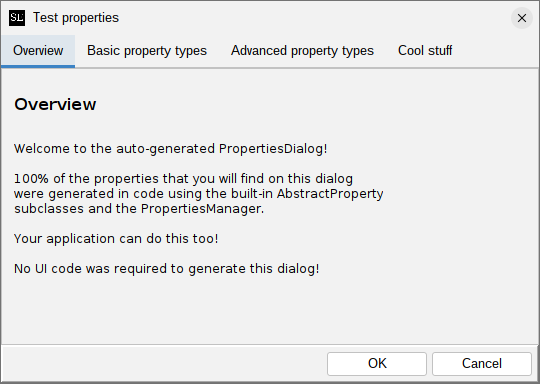
If your application uses the application extension mechanism provided by swing-extras, you will have
to override the showPropertiesDialog() method in your AppProperties implementing class, and
invoke generateClassicDialog() instead of generateDialog(), to get this style of dialog.
The new ActionPanel style
The new default style uses the ActionPanel component for navigation, and looks like this:
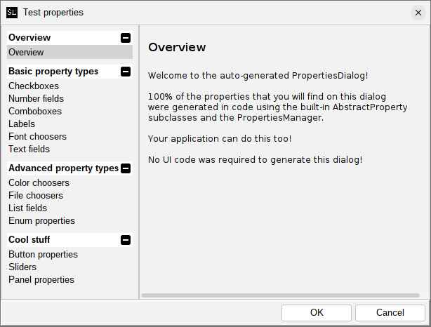
This groups actions into action groups, which are expandable and collapsible, in the left-hand pane. Clicking a property group will show the properties in that group on the right side. This new style is better suited for applications that have larger numbers of properties, and/or more properties supplied by extensions, as it allows for better organization and easier navigation. It also provides a large number of customization and styling options.
Customizing the generated dialog
If you are using AppProperties in your application, you can override the propertiesDialogCreated() method
to get a chance to inspect and modify the generated dialog after it is created but before it is shown.
For example:
@Override
protected void propertiesDialogCreated(PropertiesDialog dialog) {
    // We can customize the ActionPanel!
    if (dialog instanceof ActionPanelPropertiesDialog actionPanelDialog) {
        ActionPanel actionPanel = actionPanelDialog.getActionPanel();

        // There are many options here!
        // Refer to the ActionPanel documentation for details.
        actionPanel.getColorOptions().setFromTheme(ColorTheme.MATRIX);
    }
}
Custom form logic
It's often a requirement to add custom form logic to the properties dialog, such that certain controls are only visible or enabled when some other control has a particular value. For example, in the MusicPlayer application, we want to have the custom waveform style controls disabled, unless the user opts to override the application theme settings. When the properties dialog first comes up, the custom style fields should be disabled, like this:

And then the user selects the override option in the combo box, the form fields underneath it should be enabled automatically, like this:

How do we accomplish this?
Setting initial visibility state
Setting the initial state is quite easy. There are methods in AbstractProperty that can help with this:
public AbstractProperty setInitiallyEditable(boolean initiallyEditable) { ... }
public AbstractProperty setInitiallyVisible(boolean initiallyVisible) { ... }
When we create a new property, we can easily set its initial state based on whatever application logic
we have. And, because all setter methods in AbstractProperty use the fluent style (returning a reference
to themselves), we can chain this call quite easily:
BooleanProperty myProp = new BooleanProperty("id", "label", true).setInitiallyEditable(false);
Here we are creating a new property and setting its initial editability in one line. We could also choose to have the control initially invisible, and show it later.
Implementing custom form logic
Setting the initial state is fine, but we also need to implement logic to toggle the editability and/or visibility of a field based on changes elsewhere on the properties dialog. How do we do that?
Fortunately, this is quite easy, thanks to the addFormFieldChangeListener method in AbstractProperty.
Let's look at the actual change listener from the MusicPlayer example screenshots above:
// Make sure we respond to change events properly, to enable or disable the override fields:
overrideAppThemeWaveform.addFormFieldChangeListener(event -> {
    boolean shouldEnable = ((ComboField<String>)event.formField()).getSelectedIndex() == 1;
    FormPanel fp = event.formPanel();
    fp.getFormField(waveformBgColor.getFullyQualifiedName()).setEnabled(shouldEnable);
    fp.getFormField(waveformFillColor.getFullyQualifiedName()).setEnabled(shouldEnable);
    fp.getFormField(waveformOutlineColor.getFullyQualifiedName()).setEnabled(shouldEnable);
    fp.getFormField(waveformOutlineThickness.getFullyQualifiedName()).setEnabled(shouldEnable);
});
The PropertyFormFieldChangeListener interface provides a valueChanged method that accepts a
PropertyFormFieldValueChangedEvent as a parameter. This event parameter contains the FormField that
triggered the change, the FormPanel in which the field is located, and even the AbstractProperty that
owns the field in question. Using this information, and in particular using the getFormField method
in FormPanel to look up other form fields by their fully qualified name, we are able to look up
whatever fields we need to adjust, and invoke their setEnabled or setVisible methods as needed.
Naming properties is important!
In the previous section, we talked about the importance of giving each AbstractProperty
a meaningful fully qualified name. As we see in the example code above, this fully qualified name is passed
on to each FormField on the generated properties dialog. This is what allows you to look up a form field
when you need to modify its state.
Customizing the form field
Generally, we see a pattern emerges:
AbstractProperty  --wraps-->  FormField
----------------              -------------
BooleanProperty               CheckBoxField
ComboProperty                 ComboField
ShortTextProperty             ShortTextField
         (and so on, and so on...)
Each AbstractProperty implementation wraps a FormField implementation, and exposes some of
the configuration of that field. So, when writing an application with swing-extras, you actually
don't generally need to create your form fields directly, because whatever properties
you're working with will do that for you. Great! This provides an abstraction that lets you
focus more on what kind of data your application needs to work with, and less on how exactly
that data should be represented to the user.
But what if we want to customize the form field that our properties generate for us? What if our wrapping AbstractProperty implementation doesn't expose every possible configuration option in the wrapped FormField? Wouldn't it be nice if we had some kind of hook we could use to inspect and modify the FormField that our property generates for us?
Hooking into FormField generation
It turns out that there's a fairly easy way to do this! For example, let's say that I want to generate a checkbox, but I want to override the default font color and style for the checkbox label, and supply my own. Here's how I can hook into the FormField generation process to supply my own custom styling:
BooleanProperty myBoolean = new BooleanProperty("myBoolean", "Some checkbox label");
myBoolean.addFormFieldGenerationListener(new FormFieldGenerationListener() {
    @Override
    public void formFieldGenerated(AbstractProperty property, FormField formField) {
        CheckBoxField checkbox = (CheckBoxField)formField;
        checkbox.getFieldComponent().setForeground(Color.RED);
        checkbox.getFieldComponent().setFont(new Font(Font.MONOSPACED, Font.BOLD, 12));
    }
});
The FormFieldGenerationListener does exactly what it sounds like - it lets you listen for
the creation of FormField instances from a given AbstractProperty, not just to be notified as
to when it happens, but to allow your code to inspect and modify the given FormField to do
things that you otherwise wouldn't be able to do through the wrapping AbstractProperty alone.
Here's how our custom BooleanProperty will render with our listener in place:

One minor caveat: identifiers
One thing that you can't do in a FormFieldGenerationListener is modify the FormField's identifier
property:
myProperty.addFormFieldGenerationListener(new FormFieldGenerationListener() {
    @Override
    public void formFieldGenerated(AbstractProperty property, FormField formField) {
        formField.setIdentifier("Ha ha! I'm overriding the identifier!"); // won't work
    }
});
The AbstractProperty won't let you do this, as it would break the linkage between the generated
form field and the property that created it. So, you can call setIdentifier() all you want, but
your change will be nullified by the property, and the internal identifier will be maintained.
app-extensions
The ca.corbett.extensions package contains some powerful classes that you can use to dynamically
change the functionality of your application, without changing the code of your application itself.
Because app-extensions builds upon both swing-forms and the properties handling classes contained
within swing-extras, it is strongly recommended that you read the sections on
swing-forms and properties handling first.
How does it all work?
When designing your application, you identify certain "extension points" - that is, parts of the code where an extension could either change the way that something is done, or add additional functionality that the application does not do out of the box.
For example, let's say we're writing an application that accepts input in the form of Xml files, extracts information from those files, and writes it to a database. The loading of the input files is an obvious extension point. Could we write an extension that would allow the application to accept input in other formats? Json or CSV, for example?
For a more complex example, let's say we are writing an image editing application that supports certain image edit operations out of the box: rotate, flip, resize, and so on. Could we write an extension that dynamically adds a completely new image editing operation to our application, without changing the code of our application itself?
The app-extensions code provides a way to handle both of the example scenarios,
and many more. In the next sections, we'll look at this in detail.
General design
Designing an application with extensions in mind
The first and most important step is to identify possible extension points in your code.
Let's start with the simpler of our two examples: we want our application to be
able to accept file input in other file formats. Okay, let's start by extending the
AppExtension abstract class for our fictional application:
public abstract class MyExtension extends AppExtension {

    public abstract boolean isFormatSupported(File inputFile);
}
We've created an abstract class for our application and extended the base AppExtension
abstract class. We then add a new abstract method called isFormatSupported that accepts
a candidate file and returns either true or false based on that file's format. But
where is the logic for this method? Why not just implement right here?
Because we don't want the application to know what additional formats are supported.
The whole point of offloading this logic into an extension class is that the extension class might not exist yet. In fact, the file format that we eventually want to support might also not exist yet. We're coding for a future that hasn't happened yet. Putting the logic into the application would make the application inflexible about what formats it supports, and would require a new version of the application code down the road when we want to add support for a new file format later. The whole point of this library is to avoid that.
We will also need a way for the extension to load data from the input file and return it, presumably in the form of some model object that our application deals with. Let's do that next:
public abstract class MyExtension extends AppExtension {

    public abstract boolean isFormatSupported(File inputFile);

    public abstract MyModelObject loadFromFile(File inputFile)
            throws InputFormatNotSupportedException, InputProcessingException;
}
Okay, now we have an abstract method that our application code can invoke when loading data from input files. But the logic for this method does not exist yet and in fact won't ever exist within our application's codebase. In theory, our application can support any format we want, via extensions.
But we're not done yet. We have to write our application code to consider the existence
and the capabilities of any extensions that may be present at runtime. Let's extend the
ExtensionManager class and add some logic to it:
public class MyExtensionManager extends ExtensionManager<MyExtension> {
    // ...
    // skipping some boilerplate for now
    // ...

    public boolean isFormatSupported(File inputFile) {
        for (MyExtension extension : getAllLoadedExtensions()) {
            if (extension.isFormatSupported(inputFile)) {
                return true;
            }
        }
        return false;
    }

    public MyModelObject loadFromFile(File inputFile)
        throws InputFormatNotSupportedException, InputProcessingException {
        for (MyExtension extension : getAllLoadedExtensions()) {
            if (extension.isFormatSupported(inputFile)) {
                return extension.loadFromFile(inputFile);
            }
        }
        return null;
    }
}
The methods we add here wrap the functionality offered by our currently loaded extensions (if any). Now we in theory have what we need to modify our application's loading code to take extensions into consideration:
// ... somewhere in our application code ...
public MyModelObject loadInputFile(File inputFile)
    throws InputFormatNotSupportedException, InputProcessingException {
    // If it's an xml file, we can handle it natively:
    if (isXmlFile(inputFile)) {
        return loadXmlInputFile(inputFile);
    }

    // Otherwise, see if any of our extensions know how to handle this file type:
    if (MyExtensionManager.getInstance().isFormatSupported(inputFile)) {
        return MyExtensionManager.getInstance().loadFromFile(inputFile);
    }

    throw InputFormatNotSupportedException("Input file is not in a supported format.");
}
First, we check to see if the input file is in a format recognized by our application code itself. If so, we can handle it natively, the same way we would have before adding extension support to our application. But, if the format is unknown to us, instead of simply giving up, we can ask our extension manager if there are any registered extensions that know how to process that file type. If so, we can get that extension to handle the loading of the input file, even without our application knowing or caring about the particulars of what format it's in.
Using this same basic pattern, we can augment our application in any number of ways, allowing extensions to either enhance existing processing, or even to add new processing options that the original application codebase didn't even think of.
ExtensionManager
We should take a look at the ExtensionManager base class and its intended purpose.
This class contains methods that can scan a directory for compatible jar files and
load them dynamically (we'll discuss what we mean by "compatible" in the next section).
Once loaded, the ExtensionManager is the central authority that tracks which extensions
have been loaded, and which of them are currently enabled. Extensions can be enabled
or disabled at will by the user at runtime, and this can have drastic effects on the
UI of the application in question. If an extension is disabled, the facilities that it
provided are gone. This might mean that menu options, buttons, popup menus, and
application configuration properties related to that extension have to be hidden.
The previous example of adding support for a new file format was a fairly trivial one.
Let's look at a more complex example that involves UI changes, and we'll see how
ExtensionManager can work together with PropertiesManager to provide a consistent
and logical look and feel to your applications.
A more complex example - adding new functionality
Let's look at a more complex hypothetical scenario - we're writing an image editing application where the user can bring up an image and do certain manipulations to it: resize it, rotate it, mirror it, and etc. Many of these basic operations can be provided by the application code itself. But what if we want to support the idea that an extension could offer a brand-new image editing operation that we didn't even think of when writing the application? Can we do it? Sure!
Let's again start by extending the AppExtension abstract class, but this time let's
keep it vague instead of focusing on specific actions like loading an input file:
public abstract class MyExtension extends AppExtension {

    public abstract List<AbstractAction> getImageEditActions();
}
This abstract method allows an extension to return a list of AbstractAction
instances related to image editing. Let's again add a wrapper around this
method to our extension manager class:
public class MyExtensionManager extends ExtensionManager<MyExtension> {

    public List<AbstractAction> getImageEditActions() {
        List<AbstractAction> allActions = new ArrayList<>();
        for (MyExtension extension : getAllLoadedExtensions()) {
            List<AbstractAction> actions = extension.getImageEditActions();
            if (actions != null && ! actions.isEmpty()) {
                allActions.addAll(actions);
            }
        }
        return allActions;
    }
}
With this in place, our application can offer additional functionality wherever we are building up a list of possible image edit actions. For example, when building our edit menu:
private JMenu buildImageEditMenu() {
    JMenu menu = new JMenu("Edit");

    // Add the ones we know about natively:
    menu.add(new JMenuItem(imageRotateAction));
    menu.add(new JMenuItem(imageResizeAction));
    menu.add(new JMenuItem(imageFlipAction));

    // Now add any provided by our extensions:
    for (AbstractAction action : MyExtensionManager.getInstance().getImageEditActions()) {
        menu.add(new JMenuItem(action));
    }
}
When we initially release our application, there will not yet be any extensions for it, so the menu will only show the image edit actions that shipped with the application. But over time, as extensions are written and published, our image edit menu will automatically expand to include them.

But what happens when one of those extension actions is invoked? What can an extension actually do? Well, pretty much whatever you want. Let's look at extension code for our hypothetical image editing application:
public class AddImageBorderExtension extends MyExtension {

    @Override
    public List<AbstractAction> getImageEditActions() {
        List<AbstractAction> actionList = new ArrayList<>();
        actionList.add(new AddImageBorderAction());
        return actionList;
    }
}
And the code for our custom action is similarly simple:
public class AddImageBorderAction extends AbstractAction {

    public AddImageBorderAction() {
        super("Add border...");
    }

    @Override
    public void actionPerformed(ActionEvent e) {
        if (MainWindow.getInstance().getSelectedImage() == null) {
            JOptionPane.showMessageDialog(MainWindow.getInstance(), "Nothing selected.");
        }

        new AddImageBorderDialog(MainWindow.getInstance()).setVisible(true);
    }
}
Our extension code can reference whatever it needs from the application codebase,
because extensions are built using that code. So, as long as our application provides
ways for extensions to query for things (like MainWindow.getInstance() and getSelectedImage()),
then they will be able to interact with those things.
So now, when we register our AddImageBorderExtension, our new menu item will
show up automatically, and the new image editing functionality supplied by our
extension is added to the application.
But, how do we register and load our extension?
Registering an extension
Extensions have to package up a file called extInfo.json in their jar file.
The file can live anywhere, but a fully-qualified package name directory structure
in the jar resources is a good convention. This file contains information about our
extension:
{
  "name": "Add image border",
  "author": "steve@corbett.ca",
  "version": "1.0",
  "targetAppName": "MyAmazingImageEditor",
  "targetAppVersion": "1.0",
  "shortDescription": "Add a configurable border to selected image",
  "longDescription": "This is a test of the app extension code.\nThis will go in the README somewhere.",
  "customFields": {
    "Custom field 1": "Hello"
  }
}
We can specify a name and description of our extension, but more importantly, we can specify an application name and version, which we'll use in a moment when loading the extension. We can also specify custom fields in the form of name/value pairs of additional information for this extension. Let's try that out just to see what happens.
Okay, so, how do we tell our application about our new extension? And how does the application
actually load them? Well, that's what the ExtensionManager class is for. Somewhere
in our application startup, we should ask our extension manager to load all extensions
from jars in some known location (perhaps in an "extensions" folder in our application
install directory, or by prompting the user for it):
File extensionDir = new File("...some directory with extension jars...");
MyExtensionManager.getInstance().loadExtensions(extensionDir, MyAppExtension.class, "MyAmazingImageEditor", "1.0");
The loadExtensions method takes some parameters to help it find jar files that are appropriate
for this application. Specifically, we have to pass in the class of our AppExtension
implementation. We also provide an application name and version. This is so that extension
manager can weed out extension jars that target some other application, or extension jars
that target the wrong version of this application. This is the "compatibility" check that
we mentioned earlier. The ExtensionManager is smart enough (with the help of this extInfo.json
file supplied by each extension jar) to know which jars can be loaded and which cannot.
If an extension jar does not package an extInfo.json file in its resources, it will
not be considered for loading.
On startup, we now see that our application has registered and our menu item appears:

And when we click this new menu item, we see our border dialog comes up:

Great! Our extension is loaded and the functionality it provides has been added to our application's functionality, even without our application code knowing anything at all about the new function! We can continue now to add extensions to our application this way, building it up over time until it does many more things than it was originally designed to do.
Your application is a framework
Heavy use of ExtensionManager requires you to think of your application as more of a framework.
You need to provide access to the core parts of what your application does, and add extension points
all throughout your code, so that extensions can step in as needed to augment or even replace
parts of what your application code does. If you design your application with this in mind, writing
extensions later will be much easier, and your application might grow far beyond what you
originally envisioned for it.
But, we have a slight problem - how do we know when an application extension has been enabled or disabled? How do we know when to reload our UI?
ExtensionManagerDialog
Managing extensions, and enabling/disabling them at runtime
Wouldn't it be nice if we could provide our users with a user-friendly view
of all loaded extensions, and maybe provide a way to enable and disable them
at runtime? Well, for that we have ExtensionManagerDialog!

When we launch the ExtensionManagerDialog from our application code, we can get
a visual listing of all currently loaded extensions and their metadata. Here,
we see not only the information that we supplied about our extension, but also the
custom field that we added to our json is also present. Here, the user has the
ability to enable or disable extensions. This requires a bit more work in our application
code! In our case, if the user disables our AddImageBorder extension, we no longer
want the menu item or the dialog to show up. So, we would have to regenerate our
main menu bar. Other applications may have to re-render their UI after every time
the ExtensionManagerDialog is shown, in order to show or hide controls
provided by those extensions.
The best part about ExtensionManagerDialog is that we don't have to write a single
line of UI code in our application - we get it for free from the swing-extras library!
Also, the logic for enabling/disabling extensions is wrapped up in the
ExtensionManager base class, so our derived class simply inherits it.
Extension types
You may notice in the ExtensionManagerDialog that there is a field called Type. There
are three possible values for this field:
Application built-in: these are extensions that are provided by the Application in question. They can be disabled but they cannot be removed from the list.System extension: these are dynamically-loaded extensions from jar files located in any read-only directory (e.g./opt/YourApplication/extensions). These are intended to be shared with all users on a given system.User extension: these extensions are loaded from jar files in a read/write directory, typically in the users home directory (e.g./home/YourUsername/YourApplication/extensions). These are visible only to the user who owns them.
The application doesn't treat System extensions any differently than User extensions. This information is presented in this dialog just for informational purposes. Extension config is stored together with application config, so each user on the same system can access the same System extension, each with their own configuration (that is, "system" extensions do NOT have shared global configuration across all users on the system - rather, each user can have their own configuration for each extension). The extension code in swing-extras manages all of this for you.
Custom properties for extensions
What if our extension has many options, and we want to be able to expose those
options to the user in a friendly way so that they can be persisted? It turns out
that the app-extensions code builds on the swing-extras properties code, which
does a lot of this for us. We can modify our ExtensionManager implementation
to accommodate this. In fact, one of the methods present in the AppExtension
interface is createConfigProperties:
public class AddImageBorderExtension implements MyAppExtension {

    @Override
    protected List<AbstractProperty> createConfigProperties() {
        // ...
    }
}
This method gives extensions a way of returning a list of configuration properties.
You can take a look at some of the facilities in the swing-extras library to see
what's possible here, specifically the PropertiesManager.
Let's modify our extension to return some custom config properties:
public class AddImageBorderExtension implements MyAppExtension {

    @Override
    protected List<AbstractProperty> createConfigProperties() {
        List<AbstractProperty> props = new ArrayList<>();

        props.add(new ColorProperty("UI.Borders.color", "Default border color:", ColorType.SOLID, Color.RED));
        props.add(new IntegerProperty("UI.Borders.thickness", "Default border width:", 4,0,100,1));

        LabelProperty label = new LabelProperty("UI.Borders.label",
                  "This properties tab was added by an extension!");
        label.setExtraMargins(12,12);
        label.setColor(Color.BLUE);
        props.add(label);

        return props;
    }
}
And in our application startup code, we can gather all of our properties
and all of our extension properties together when creating our PropertiesManager:
private void loadConfig() {
    List<AbstractProperty> props = new ArrayList<>();

    // Load the properties that our application natively knows about:
    props.addAll(getGeneralProps());
    props.addAll(getDiskProps());

    // Also ask our ExtensionManager for any extension-supplied props:
    props.addAll(MyExtensionManager.getInstance().getAllEnabledExtensionProperties());

    propsManager = new PropertiesManager(PROPS_FILE, props, "MyAmazingImageEditor");
    propsManager.load();
}
Now, when we generate and launch the PropertiesDialog from our application code,
we see that our extension's properties have been added to a new tab:

And we didn't have to write any UI code at all to support this!
But it gets even better
Now that we've covered all the groundwork, let's look at arguably the most important class in the whole system...
AppProperties
Using AppProperties to combine PropertiesManager and ExtensionManager
To make things even easier, the app-extensions code also includes a
wrapper class AppProperties, which combines a custom ExtensionManager
together with a PropertiesManager instance. This allows those two classes
to co-ordinate things like the enabled/disabled status of extensions, and makes
the client code just a little easier to manage. Basically, once our AppProperties
instance exists, we can invoke the save() and load() methods as needed to
load properties and extension enabled status to and from our config file.
Setting up a new AppProperties instance is fairly straightforward:
public class MyAppProps extends AppProperties<MyAppExtension> {
   public MyAppProps() {
       super("MyAmazingImageEditor", new File("mypropsfile"), MyExtensionManager.getInstance());
   }

   @Override
   protected List<AbstractProperty> createInternalProperties() {
       List<AbstractProperty> props = new ArrayList<>();

       // Load the properties that our application natively knows about:
       props.addAll(getGeneralProps());
       props.addAll(getDiskProps());

       return props;
   }
}
Basically, we just need to provide the location on disk where our configuration should
be saved and loaded, and then override the createInternalProperties method
to specify the properties that our application knows about natively.
But wait... where do we load the properties from our extensions? We had to do that
manually earlier, didn't we? It turns out the AppProperties class can do this for us,
because it contains both a PropertiesManager and an ExtensionManager together.
So, our application code can be simplified a bit.
There are convenience methods in AppProperties that make generating and showing
the properties dialog and the extension manager dialog very simple:
// Show the application properties dialog:
if (myAppProps.showPropertiesDialog(MainWindow.getInstance())) {
    // User okayed the properties dialog...
    // reload our UI to reflect the new property values
}

// Show the extension manager:
if (myAppProps.showExtensionDialog(MainWindow.getInstance())) {
    // User okayed the extension manager dialog...
    // reload our UI to show/hide extension-related options
}
Great! Having the configuration properties managed by PropertiesManager and the
extension enabled/disabled status managed by ExtensionManager makes our code so
much easier. Combining those two classes together into a custom AppProperties class
makes it even easier!
AppProperties.peek
It's worth a quick sidetrack at this point to talk about AppProperties.peek(). This method allows you to
"peek" at the currently-saved value of a property in the properties file, without actually loading that
properties file. Why would you need to do this?
Setting initial property states
Occasionally, you may wish to set the initial state of some property based on the value of some other
property. This creates a chicken-and-egg type of situation, where you can't properly write your
createInternalProperties() method without that value, but you can't get that value until after
the properties have been created. We can get around that by "peeking" at the value in the
properties file, if it exists.
Let's look at a hypothetical situation where I have some property,
let's call it "X", whose visibility is controlled by a checkbox labelled "Enable X". When the checkbox
is checked, the X property becomes visible, and when the checkbox is unchecked, then the X property
should be hidden. This is reasonably straightforward to implement, but we have a slight problem when
setting the initial visibility of property X. Let's see how peek() can help us here:
@Override
protected List<AbstractProperty> createInternalProperties() {
    List<AbstractProperty> props = new ArrayList<>();

    // ... creating all of our properties ...

    // We'll have a checkbox to enable property "X" (whatever it is), and a property for X itself:
    BooleanProperty enableXProperty = new BooleanProperty("enableXProperty", "Enable X property", true);
    ShortTextProperty someXProperty = new ShortTextProperty("someXProperty", "Enter X:", "");

    // Now wire them up so that the checkbox shows or hides the X property at runtime:
    enableXProperty.addFormFieldChangeListener(event -> {
        boolean isEnabled = ((CheckBoxField)event.formField()).isChecked();
        FormField field = event.formPanel().getFormField("someXProperty");
        field.setVisible(isEnabled);
    });

    // That's great, but I also want to set the *initial* state of the X property.
    // It seems like I can't do that here, because the properties are not yet loaded!
    // i.e. I can't ask the checkbox for its current value because it's not yet properly initialized.
    // But we can "peek" at its value currently in the file, even before we load it:
    String peekedOption = peek(myConfigFile, "enableXProperty");
    if (peekedOption != null && ! peekedOption.isBlank()) {
        someXProperty.setInitiallyVisible(Boolean.parseBoolean(peekedOption));
    }
}
Now, when the properties dialog is created and shown, the initial state of property X is guaranteed
to be properly set. After that initial setup, the FormFieldChangeListener handles toggling visibility
as the checkbox is selected or unselected.
If the config file is empty because this is the first run and no properties have been
saved, then peek() will simply return an empty string.
This scenario is something that probably won't come up very often, but the peek() method provides a handy way
to preview the config properties before they are loaded, in the rare cases where that is needed!
Extension load order
Most of the time, the order in which extensions are loaded from disk doesn't matter, and so the default load order (alphabetically by jar file name) is fine. However, there are some circumstances where you want to ensure that extension A loads before extension B. Consider the following hypothetical method in our application's ExtensionManager implementation:
public boolean handleKeyEvent(KeyEvent keyEvent) {
    for (MyAppExtension extension : getEnabledLoadedExtensions()) {
        if (extension.handleKeyEvent(keyEvent)) {
            return true;
        }
    }
    return false;
}
When a KeyEvent is received, our extension manager will iterate through all of our enabled and loaded
extensions in the order in which they were loaded, asking each one if it wants to handle that particular
key event. The first extension that handles the event terminates the search. So what happens if there
are two extensions that can both handle the same KeyEvent? Well, whichever one was loaded first will
be able to process it, and the other one will not be called upon.
One possible approach to solve this is to continue making the KeyEvent available to all other extensions,
even after an extension has handled it. But perhaps we only want the KeyEvent to be handled by one single
extension. This same general pattern can appear whenever there is some kind of event within the application
that might be handled by an extension - sometimes, we only want ONE extension to handle it, and no more.
But how can we control which one?
The default sort order
By default, all extension jars within the extension jar directory are loaded in alphabetical order. So, we can control load order by naming our jars carefully. For example:
0001_important_extension.jar
0002_less_important_extension.jar
9999_really_unimportant_extension.jar
This will ensure that the 0001_important_extension.jar is loaded before the others. The ExtensionManager will
always query extensions in the order they were loaded, so in this case, the 0001 extension will always get
first kick at the cat.
But this approach requires manual filename manipulation, and is therefore a little clunky and fragile. Is there a better way?
A better way: ext-load-order.txt
ExtensionManager will automatically look for an optional file called ext-load-order.txt in the extension
jar directory. If present, this file can specify the order of extensions by naming one jar file per line
within the file. For example:
# ext-load-order.txt
#
# Blank lines and lines starting with # are ignored
important_extension.jar
less_important_extension.jar
Any jars named in this file will be loaded in the order specified BEFORE the rest of the jars in the extension jar directory are loaded. So, if a jar file is not explicitly mentioned in this text file, it will be loaded after any jar that is mentioned.
If the file is not present, load order will revert to the default load order described above.
Verifying extension load order
ExtensionManager will output log information as extensions are loaded. This can be used to easily verify
that extensions are being loaded in the expected order. For example:
2025-06-11 09:04:54 P.M. [INFO] Extension loaded externally: Important Extension
2025-06-11 09:04:54 P.M. [INFO] Extension loaded externally: Less important extension
2025-06-11 09:04:54 P.M. [INFO] Extension loaded externally: Really unimportant extension
Here we see the expected results. You can increase the log level for the ca.corbett.extensions package to FINE
if you wish to see more information about the extensions that are being scanned and loaded, but the default
INFO log level will show you basic information that is sufficient for verifying load order.
Discovering extensions
How do users of your application find and install new extensions? How do they update existing extensions
when a new version is made available? Prior to swing-extras 2.5 release, this was an entirely manual
process of distributing jar files and having the user copy them into your application's extensions directory.
But now, there's a much better way!
Dynamic extension discovery
Starting with the 2.5 release of swing-extras, your application can now package an update_sources.json file
that describes where to look for new extensions, or new versions of existing extensions. An example from
the ImageViewer application looks like this:
{
  "applicationName": "ImageViewer",
  "updateSources": [
    {
      "name": "www.corbett.ca",
      "baseUrl": "http://www.corbett.ca/apps/ImageViewer",
      "versionManifest": "version_manifest.json",
      "publicKey": "public.key"
    }
  ]
}
This json file simply points to some web host where you have put your extension jars, along with a
version_manifest.json that describes the exact versions that are available. You can also optionally
specify a public key, which the application will automatically use to verify the digital signature
of downloaded extension jars (assuming you decided to sign them - highly recommended but not mandatory).
To see what this looks like in practice, let's look at the ExtensionManagerDialog for the ImageViewer application, but this time, let's click on the "Available" tab to download a list of extensions:

Here we can see a list of extensions that are provided by the web host that you specified in
the update_sources.json file. This list is dynamically retrieved, so the latest available extension
versions are shown here. In this example, we see (installed) beside each extension name, except
for the ICE extension (the selected one). This means that all the other extensions are already installed,
and we have the option to install the ICE extension by using the "install" button in the top right.
Note that extensions can have screenshots! Double-clicking one of the screenshots for ICE allows us to see a screenshot of one of the dialogs provided by this extension:

So, let's say I want to install this extension. What happens when I click "install"?
Installing new extensions automatically
Clicking "install" kicks off the following process:
- The extension jar is downloaded
- The extension's digital signature is downloaded (if signed)
- The update source's public key is used to verify the signature
- If it matches, the extension is installed and the application is restarted.
Let's look at some of those steps in detail:
Downloading unsigned extensions
Digitally signing extension jars is not mandatory. However, it is strongly recommended, so that your users know that the jar file downloaded correctly and that its signature matches with the public key that you provided on your web host. If an extension is not signed, the following warning is shown:

The user is warned, but is given the option to proceed anyway. If the user declines, the downloaded extension jar is discarded and is NOT installed.
Signature mismatches
Rarely, a download may fail, and result in a corrupt file. Or, hopefully even more rarely, a malicious actor may somehow upload a fake jar file to your web host. If the digital signature fails to match against the public key, the following warning is shown:

The user is strongly warned about this very suspicious event, but nonetheless is still given the option to proceed regardless.
Restarting the application
The application must restart in order for the extension to be activated. The following prompt is shown:

(See the section on shutdown hooks for an important note about restarts).
Updating extensions
Discovering and installing new extensions is great, but it doesn't stop there! What if a new version of an existing extension is published? Can users upgrade from the older version to the newer version? Yes, they can!

Let's say I'm currently using version 2.3.0 of the "Transform image" extension. When I go
to the "Available" tab of the ExtensionManagerDialog, as shown above, I notice a new
"Update" button has been added to the top right. The application has detected that
a newer version 2.3.1 of this extension exists on the remote web host, and I now have
the opportunity to update this extension.
The download process is largely the same as described early for installing extensions. The jar file is downloaded and its digital signature is verified. If it matches, then the old jar file is deleted and the new one is moved into place. Then, the same "restart application" prompt will appear.
Uninstalling extensions
Both the "Installed" tab and the "Available" tab in the ExtensionManagerDialog will offer an "uninstall" button for each extension. Clicking this will simply remove the jar in question and then show the application restart prompt.
Note: built-in extensions cannot be uninstalled, as they are not loaded from jar files, but rather packaged with the application itself.
Great, but how do I set it all up?
Is it necessary to create the update_sources.json and version_manifest.json by hand?
No! There is a very useful helper application for this exact purpose: ExtPackager
Let's look at that in the next section!
ExtPackager
ExtPackager is a separate project on GitHub: https://github.com/scorbo2/ext-packager

The ExtPackager application makes generating your json very easy. The application can walk you
through the entire process:
- Creating and naming a project
- Generating a private/public key pair for signing
- Defining the location of your remote web host
- Importing one or more extension jars to make available
- Signing your jar files
- Uploading (via FTP) the result to your web host
Let's look at these steps in detail.
Generating a key pair

Remember that digitally signing your extension jars is optional, but strongly recommended.
Fortunately, with ExtPackager, it's as easy as clicking one button. The private key is stored in the project directory, and the public key is stored in the distribution directory. The public key will therefore be uploaded to your remote web host, but the private key will not be uploaded. Keep it safe.
Specifying a remote web host

Here we can specify the location of our remote web host, and the URL that the application will hit to retrieve our version manifest and our extension jars.
Adding a remote host is fairly straightforward:

We must supply a source name (this will be shown to the user if more than one remote host is specified, to differentiate them), and a "base URL". All download paths are relative to this base URL. That means that all of the extension jars supplied by this remote host must live on the same web server.
But what if I want to host extension jars on multiple servers?
That's actually not a problem! You can simply define multiple update sources. When the user visits the "Available" tab of the ExtensionManagerDialog, they will be given the ability to choose between the available update sources:

Building the version manifest
The json for the version manifest can be very long and quite complex. Fortunately, you don't really ever have to edit it manually. ExtPackager makes the process reasonably straightforward:

This may look complicated, but really, the most important button on this page is "Import", which allows you to browse for your extension jar(s). Once imported, ExtPackager will build the version manifest, even if you have supplied multiple versions of your extension jar files.
In the screenshot above, for example, we can see that there are two available versions of the "Transform image" extension. When the user visits the ExtensionManagerDialog for this application, the latest version will be detected and made available for install (or for update, if the user has an older version installed).
You can re-visit this tab later, as you add new extensions or create new versions of existing extensions. Simply go through the same import process as above with the new jars, and they will be built into the version manifest, which can then be re-uploaded to your web host.
Adding screenshots
Double-clicking any extension version will bring up the details dialog, which contains a screenshots field at the bottom:

You can drag images from your file system to this screenshots field, and ExtPackager will automatically add them to the version manifest, so that users can view them in the ExtensionManagerDialog.
Signing jar files

Digitally signing jar files is very easy, assuming you created a key pair on the "Key management" tab first. Simply click "Sign all jars" and the digital signatures will be generated and added to the version manifest.
If you add new extensions later, or new versions of existing extensions, you can return to this tab, and the "Sign all jar" button will give you some options:

You have the option of either signing only jars that aren't currently signed, or forcing a re-sign of all jars. The "resign all jars" option is also useful if you ever regenerate your key pair.
Uploading the result

Once your jars are all signed, screenshots have been added, and your version manifest is ready to go, you can visit the Upload tab, shown above, to upload the entire thing to your remote web host. If FTP is not an option, or you prefer to do this manually, you can look for the "dist" subdirectory in your ExtPackager projects location (default ~/.ExtPackager/projects), and upload all contents yourself.
Don't forget to package the update_sources.json file with your application! Your application needs this
to locate the version manifest and figure out what extension jars are available.
Wiring it all up
In your application code, you can use the optional extra parameter to AppProperties.showExtensionDialog() to link
up your update sources:
// Load the update_sources.json file:
UpdateSources updateSources = UpdateSources.fromFile(myUpdateSourcesJsonFile);

// Create an UpdateManager to encapsulate it:
UpdateManager updateManager = new UpdateManager(updateSources);

// Give this UpdateManager to AppProperties when launching ExtensionManagerDialog:
myAppProperties.showExtensionDialog(myMainWindow, updateManager);
Congratulations! The "Available" tab will appear automatically on your ExtensionManagerDialog, and your users will have the option of installing new extensions, or updating existing ones!
Extension versioning
As your application goes through normal development and extension over time, you may find that it becomes
a bit cumbersome to match which versions of your extensions were written for which version of your application.
Of course, each extension publishes an extInfo.json as described in the section Registering extensions.
This json file explicitly says which version of the app that extension targets. But, this is not immediately obvious
from looking at the extension jar directory. For example:
app-extension-name-1.0.jar # This one was written for application version 1.0
app-extension-name-1.1.jar # This one was also written for application 1.0
app-extension-name-1.2.jar # This one was released for application 1.1
app-extension-name-1.3.jar # This one was released for application 2.0... wait, what?
We see we've gone through a few versions of both the application and extension, and there's no way to tell at a glance what app version each of these extension versions intended to target.
A versioning convention
For this reason, the following convention is suggested - nothing in the code enforces this! Of course, you can ignore this suggestion and version your extensions and your application however you like... but the below suggestion is what I do, and I find it avoids headaches:
- Applications use a major.minor version scheme
- Extensions use a major.minor.patch version scheme
- The extension major.minor matches the application version that it targets
- The extension patch number can be used for subsequent versions of the same extension targeting the same application version
This convention allows us to easily determine compatibility just by looking at the jar files:
app-extension-name-2.1.0.jar (targets app version 2.1)
app-extension-name-2.1.1.jar (targets app version 2.1)
app-extension-name-2.2.0.jar (targets app version 2.2)
app-extension-name-3.0.0.jar (targets app version 3.0)
And so on. Now the guesswork is removed, and we know which jar files apply to the version of the application we're using.
Backward and forward compatibility
Starting in swing-extras 2.6, the extension loading system has been enhanced to allow for
some backward and forward compatibility when loading extensions. The old approach in ExtensionManager was very strict:
Determining compatibility (the old, strict approach, pre-2.6):
- An extension is compatible with the application only if its target application version (as specified in
extInfo.json) exactly matches the current application version. - If an extension targets version 2.1 of the application, then that extension jar may ONLY be used with application version 2.1.
- This means that every minor application release necessitates a new release of every extension that targets that application! Even if no breaking changes were made in the extension API.
Determining compatibility (the new, more flexible approach, 2.6 and later):
- An extension is compatible with the application if its target application version (as specified in
extInfo.json) is less than or equal to the current application version, but with the same major version. - If an extension targets version 2.1 of the application, then that extension jar may be used with application versions 2.1, 2.2, 2.3, etc., but NOT with version 3.0 or later.
- This allows extensions to be forward-compatible with future minor versions of the application, assuming no breaking changes were made in the extension API.
- So, applications can release new minor versions, and all existing extensions will still work with the new minor version.
The new approach is less strict, but it comes with an important caveat: it assumes that no breaking changes were made in the extension API between minor versions of the application. If breaking changes were made, then the extension may not function correctly, even if it is considered "compatible" by the above rules. This means that applications must exercise discipline when releasing new versions of themselves:
- A new minor version of the application (e.g., 2.1 to 2.2) should not introduce breaking changes to the extension API!
- Breaking changes should only be introduced in new major versions of the application (e.g., 2.x to 3.0).
ExtensionManager may fail to load an extension if there have been breaking changes in the application since
the extension was written. This may result in a NoSuchMethodError, ClassNotFoundException, or similar error when the extension is loaded.
Applications should document any breaking changes in their extension API in their release notes, so that extension developers are aware of them.
Extension resources
It's a fairly common use case for extensions to package some resource that needs to be loaded. For example,
an icon to display on a button, or an audio file to play when certain actions happen. Of course, these resources
can be packaged into the jar file and then loaded via getClass().getResourceAsStream().
However! Due to the way extension jars are dynamically loaded, you can only load resources in your constructor,
or in the loadJarResources() method. The class loader that loads the jar is closed after the extension is
loaded, so any attempt to do getClass().getResourceAsStream() will return null after your extension is
instantiated.
Here's the load order:
- ExtensionManager opens the extension jar file
- Extension main class is instantiated (your constructor fires)
- ExtensionManager invokes
createConfigProperties()exactly once - ExtensionManager invokes
loadJarResources()exactly once - ExtensionManager closes the jar file (class loader is gone)
So, any resources that you need to load should be loaded either in your constructor or in the
loadJarResources() method. This also applies to loading the extInfo.json file as a resource
in your extension. For example:
public class MyExtension extends MyAppExtension {
    private final AppExtensionInfo extInfo;
    private BufferedImage someIcon;

    public MyExtension() {
        // We can safely load resources here in the constructor:
        extInfo = AppExtensionInfo.fromExtensionJar(getClass(), "/path/to/extInfo.json");
        if (extInfo == null) {
            throw new RuntimeException("MyExtension: can't load extInfo.json!");
        }
    }

    @Override
    public void loadJarResources() {
        try {
            // It's also safe to load jar resources here in the loadJarResources method:
            someIcon = ImageUtil.loadFromResource(getClass(), "/path/to/icon.png", 32, 32);
        }
        catch (IOException ioe) {
            throw new RuntimeException("MyExtension: can't load icon resource!", ioe);
        }
    }
}
Attempting to lazy-load any resource outside of your constructor or the loadJarResources() method will fail!
private void someExtensionMethod() {
    // Hmm, I think I'll load another icon now...
    InputStream inStream = getClass().getResourceAsStream("/some/icon.png");

    // Oh no - inStream is null! We should have done this in loadJarResources()...
}
Sharing extension config
Generally, extensions that expose config properties will expose properties that are specific to that extension. This is enforced by specifying a unique fully-qualified property name, as described in the properties section. For example:
// In our custom extension class:
@Override
protected List<AbstractProperty> createConfigProperties() {
    return List.of(new BooleanProperty("CustomExtension.CustomExtension.fieldName", "My checkbox"));
}
This will create a new tab on the properties dialog called CustomExtension with a checkbox labeled "My checkbox".
Not only is the name unique, but this property will be physically separated by the others by placing it into
a new tab just for this extension.
But, sometimes, we have a set of related extensions that might share some common configuration properties. For example, there might be multiple extensions for a document-processing application. These related extensions might each add a different kind of annotation or footnote to the current document. The font size, face, and style of these annotations can be controlled with config properties. But, we don't want to clutter the properties dialog with multiple properties for font selection. Can we set it up so that all of our related annotation extensions use the same font property? Yes we can!
The solution is for each extension to specify a property with the same fully qualified name. ExtensionManager is
smart enough to filter out duplicates from the combined list. This means that only one property will be created
for each unique name, regardless of how many extensions expose that property. To illustrate the above scenario,
each of our annotation extensions could have the same implementation of createConfigProperties:
@Override
protected List<AbstractProperty> createConfigProperties() {
    return List.of(new FontProperty("Annotations.Font.fontSelector", "Annotation font:"));
}
Now only one font control will be added to the properties dialog, and all extensions that registered a config property with that name will be able to query the value of it. This allows the user to set the annotation font settings just once, and all annotation extensions (regardless of how many there are!) will use those settings. Even if a new annotation extension is added later, if it also registers a property with the same name, then it will also be able to immediately make use of the user's preferred annotation font setting.
It's just that easy!
Shutdown hooks
If your application supports dynamic extension discovery and download as discussed in sections 3.7 and 3.8, then you should know that your application will need to restart in order to install, uninstall, or update any extension jar. This application restart is handled by ExtensionManager and you generally don't need to worry about it.
However! Your application may have some kind of cleanup method that gets invoked when shutting down, to handle cleaning up resources, closing database connections cleanly, and so on. Here's a hypothetical example:
/**
 * Perform normal shutdown tasks before the application exits.
 */
private void cleanupAndShutDown() {
    // Save the size and position of open windows:
    saveUIState();

    // Tell all of our extensions that we are shutting down:
    myExtensionManager.deactivateAll();

    // Close any open database connections:
    DatabaseManager.getInstance().close();

    // Save anything that may not have been persisted:
    myDocumentManager.saveAll();
}
This is all well and good, but the application restarts fired by ExtensionManagerDialog will use System.exit(), which will cut your cleanup method out of the loop. How do we fix this?
Registering a shutdown hook
The UpdateManager class provides an easy mechanism for this:
// Somewhere in your startup code...
myUpdateManager.registerShutdownHook(MainWindow::cleanupAndShutDown);
This registers your cleanupAndShutDown() method with the UpdateManager class, so that
the UpdateManager knows to invoke your cleanup method before restarting the application.
You can register as many shutdown hooks as you need.
Note that this is not a replacement for your normal cleanup scheme! The shutdown hook is only invoked when UpdateManager restarts your application, not when your application exits normally.
Failing to register a shutdown hook
If you have not registered any shutdown hooks, you will notice a warning issued in the log during an application restart:
[WARNING] No shutdown hooks are registered! Application may not terminate cleanly.
This is a hint that you should register at least one shutdown hook to provide a clean termination of your application during a restart.
Real-life examples
The app-extensions library is not just hypothetical code - it's been used in several applications to great effect! Here are just a few examples of actual extensions:
MusicPlayer
The MusicPlayer application has had extension capabilities for several versions now. Extensions can provide additional functionality not provided by the application itself. Let's look at the ExtensionManagerDialog presented by MusicPlayer:

We can see the four "built-in" extensions that come with the MusicPlayer application, along with two extra extensions called "Scenery" and "Stats tracker".
Built-in extensions
Application can ship with some "built-in" extensions, to show what extensions can do with the application. Unlike jar-loaded extensions, these "built-in" ones can be disabled but can't be removed. Adding extensions programmatically is quite easy:
// Load all the built-in extensions:
addExtension(new ExtraThemes(), true);
addExtension(new ExtraAnimations(), true);
addExtension(new ExtraVisualizers(), true);
addExtension(new QuickLoadExtension(), true);
Supplying "built-in" extensions like this can be a great way of testing our your extension points with actual extensions (this often reveals places where more extension points are needed), and also provides your users with a template they can follow to write their own extensions.
If we take a look at MusicPlayer's config dialog, we can see lots of dynamically loaded configuration properties:

The visualizer tab that we're looking at was added by the ExtraVisualizers extension. Disabling this extension
results in this tab being hidden and the option for the "rolling waves" visualizer disappears from the application.
Extensions for MusicPlayer can provide new fullscreen visualization effects to show while music is playing. The Scenery extension for MusicPlayer is an interesting example of this. It shows gently scrolling landscape scenery images, with programmable "tour guides" that can appear at configured intervals to offer commentary either on the currently playing track, or on the currently shown scenery image:

ImageViewer
The ImageViewer application was also designed with extension in mind. Almost all built-in functionality within the app is extensible, allowing the creation of extensions that can do almost any kind of manipulation on the currently shown image.
Let's look at ImageViewer's ExtensionManagerDialog:

We see there are many extensions available for this application, because it has been under development for quite a long time.
Here are just some of the extensions for ImageViewer:
- Image Transform - rotate or flip an image
- Image Resize - resize an image or a directory of images
- Image Converter - convert an image or a directory of images between jpg and png formats
- Full Screen - presents a directory of images as a fullscreen slideshow
- ICE - allows semantic tagging and searching of images
It starts with extensible application design
ImageViewer is actually a good example of an application that was designed with extensibility in mind. Take a look in particular at the ImageViewerExtension abstract class to see what kind of functionality is exposed to ImageViewer extensions. The ImageViewerExtensionManager class handles interrogation of currently loaded and enabled extensions to see what features they offer.
It's difficult, but not impossible, to add extension capabilities to an application as an afterthought. It's therefore recommended to think about possible extension points early in the application's development! You are only limited by your own creativity! Try to think up ways that your application could be extended!
Image handling
The ca.corbett.extras.image package contains some utility classes and components related
to image handling. This includes not only wrappers around Java's built-in image IO facilities,
but also extra features and conveniences for making images much easier to deal with in
your application.
ImageUtil
The ImageUtil utility class provides convenient wrappers around some functionality in Java's image IO library.
Loading and saving images
We get the following utility methods (javadoc omitted for brevity):
public static ImageIcon loadImageIcon(final File file) {...}
public static ImageIcon loadImageIcon(final URL url) {...}
public static BufferedImage loadImage(final URL url) throws IOException {...}
public static BufferedImage loadImage(final File file) throws IOException {...}
public static void saveImage(final BufferedImage image, final File file) throws IOException {...}
public static void saveImage(final BufferedImage image, final File file, float compressionQuality) {...}
public static void saveImage(final BufferedImage image, final File file, ImageWriteParam writeParam) {...}
public static void saveImage(final BufferedImage image, final File file, ImageWriter writer, ImageWriteParam writeParam) {...}
We see that we have numerous options for easily loading and saving images in the following formats:
- jpeg, with configurable compression options
- png for lossless image storage, includes support for transparency
- gif, including support for animated gifs
Generating thumbnail images
ImageUtil also contains facilities for easily generating "thumbnail" images (these are scaled-down versions
of larger images, suitable for use as an image preview):
public static BufferedImage generateThumbnail(final File image,
                                              final int width,
                                              final int height) throws IOException {...}
public static BufferedImage generateThumbnail(final BufferedImage sourceImage,
                                              final int width,
                                              final int height) {...}
public static BufferedImage generateThumbnailWithTransparency(final File image,
                                                              final int width,
                                                              final int height) throws IOException {...}
public static BufferedImage generateThumbnailWithTransparency(final BufferedImage sourceImage,
                                                              final int width,
                                                              final int height) {...}
We see that it can work either with images already in memory (in the form of a BufferedImage), or with
images saved on disk (sparing you from having to do the I/O).
ImagePanel
The ImagePanel is a custom JPanel implementation that can display an image with many options
for determining how the image is to be displayed. All images types are supported - even animated GIF
images can be displayed!

Here we see that the image to be displayed does not perfectly fit into the ImagePanel. That's not
a problem - we select the BEST_FIT display option, and the image will be scaled down to fit inside
the panel, without stretching or distorting the image in the process. This may result in empty space
either above and below the image (as seen above), or on the left and right sides of the image,
depending on whether the image to be displayed is too wide or too tall to fit inside the panel.
We can change the display option to STRETCH if we want the image to completely fill the panel, but
this will result in distorting the image to make it fit:

We also have options for allowing the mouse wheel to zoom in and out of the image, and allowing
to click+drag the mouse when zoomed in, to scroll the image around in the panel. ImagePanel
also offers performance-related options for deciding whether to prioritize image quality versus
speed when doing things such as scaling and zooming.
Animated GIFs
The ImagePanel class offers native support for animated GIF images! This is actually supplied
by the built-in Java class ImageIcon.
if (imageFile.getName().toLowerCase().endsWith(".gif")) {
    ImageIcon icon = new ImageIcon(imageFile.getAbsolutePath());
    imagePanel.setImageIcon(icon);
}
else {
    BufferedImage image = ImageUtil.loadImage(imageFile);
    imagePanel.setImage(image);
}
The above example code will invoke the correct ImagePanel method depending on whether
the image is a GIF image or not. Generally speaking, ImagePanel prefers dealing with
BufferedImage instances, because we can store the entire raster of pixels in memory
to make it easier to handle things like scaling or stretching. But, animated GIF images
must be represented by an ImageIcon instance, so slightly different handling is required.
All of the same display options still work! You can stretch, scale, and zoom animated GIF images even as the animation is playing. This can either be done programmatically or via user input (via mouse clicks or mouse wheel, if those options are enabled in the image panel).
ImageTextUtil
With the ImageTextUtil utility class, we can easily render text onto an image, with many
configuration options:

Let's look at the methods that we have available to us here (javadoc omitted for brevity):
public static void drawText(BufferedImage image, String text) {...}
public static void drawText(BufferedImage image, String text, Font font, Color outlineColor, Color fillColor) {...}
public static void drawText(BufferedImage image, String text, Font font, Color outlineColor,
                            Color fillColor, TextAlign align) {...}
public static void drawText(BufferedImage image, String text, int lineLength, Font font,
                            TextAlign align, Color outlineColor, float outlineWidthFactor, Color fillColor) {...}
public static void drawText(BufferedImage image, String text, int lineLength, Font font,
                            TextAlign align, Color outlineColor, float outlineWidthFactor,
                            Color fillColor, BufferedImage fillTexture, Rectangle rect) {...}
We see that the simplest option simply takes the BufferedImage onto which we should render the text,
and the text itself. There are more and more complicated overloads of this method to expose further
configuration options for rendering the text.
We can use the lineLength parameter to determine at what point (based on character count) line-wrapping
should occur. If not specified, the default line length is 30 characters.
We can also control the positioning of the text within the image using the TextAlign enum:
public enum TextAlign {
    TOP_LEFT("Top left"),
    TOP_CENTER("Top center"),
    TOP_RIGHT("Top right"),
    CENTER_LEFT("Center left"),
    CENTER("Dead center"),
    CENTER_RIGHT("Center right"),
    BOTTOM_LEFT("Bottom left"),
    BOTTOM_CENTER("Bottom center"),
    BOTTOM_RIGHT("Bottom right");
    //...
}
Gradients
The ca.corbett.extras.gradient package contains some neat utilities and components related
to color gradients. Let's start with a visual demonstration of the capabilities, and then take
a look at the code.


We can also render text with a color gradient:

Integration with swing-forms
The ColorField in swing-forms understands both solid colors or color gradients, and allows
you to present a form field for user selection of both or of either. You can also use the
GradientColorChooser to allow your users to configure a color gradient interactively if you
are not working with swing-forms.
Integration with properties
The ColorProperty property in ca.corbett.extras.properties understands both solid colors
or color gradients, and allows you to create a property that allows the user to choose either
one, or restricts them to one or the other.
Other integrations
If your application uses a JDesktopPane, you may want to consider upgrading to the
swing-extras class CustomizableDesktopPane, which allows you
to use a gradient as a background.
Of course, the gradient images generated by the GradientUtil are compatible with
ImageUtil, so you can easily generate gradient images and save them.
How do I generate gradients?
Everything is driven from the Gradient record, which is very easy to set up:
public record Gradient(GradientType type, Color color1, Color color2) {

    public static Gradient createDefault() {
        return new Gradient(GradientType.VERTICAL_STRIPE, Color.WHITE, Color.BLACK);
    }
}}
This record contains a static factory method for creating a "default" gradient quickly
and easily, or you can create a new one by specifying the start and end colors for the gradient,
and then selecting a GradientType:
public enum GradientType {

    /**
     * Describes a single gradient that progresses linearly from left to right, color 1 to color 2.
     */
    HORIZONTAL_LINEAR("Horizontal linear"),

    /**
     * Describes a single gradient that progresses linearly from top to bottom, color 1 to color 2.
     */
    VERTICAL_LINEAR("Vertical linear"),

    /**
     * Describes a two-part gradient that progresses linearly from top to center, color 1 to
     * color 2, and then center to bottom, color 2 to color 1. The end result is a gradient that
     * looks like a horizontal stripe running along the center of the image.
     */
    HORIZONTAL_STRIPE("Horizontal stripe"),

    /**
     * Describes a two-part gradient that progresses linearly from left to center, color 1 to
     * color 2, and then center to right, color 2 to color 1. The end result is a gradient that
     * looks like a vertical stripe running up the center of the image.
     */
    VERTICAL_STRIPE("Vertical stripe"),

    /**
     * Represents a single gradient that progresses linearly from top left to bottom right,
     * color 1 to color 2.
     */
    DIAGONAL1("Diagonal 1"),

    /**
     * Represents a single gradient that progresses linearly from bottom left to top right,
     * color 1 to color 2.
     */
    DIAGONAL2("Diagonal 2"),

    /**
     * Describes a four-part gradient that progresses linearly from each corner of the image
     * towards the center, color 1 to color 2.
     */
    STAR("Star");

    // ...
}
From there, we can talk to the GradientUtil class, which has methods for actually rendering the gradient:
public static BufferedImage createGradientImage(Gradient conf, int width, int height) {...}
public static void fill(Gradient conf, Graphics2D graphics, int x1, int y1, int width, int height) {...}
public static void drawRect(Gradient conf, Graphics2D graphics, int x1, int y1, int width, int height) {...}
public static void drawString(Gradient conf, Graphics2D graphics, int textX, int textY, String string) {...}
public static void drawString(Gradient conf, Graphics2D graphics, int gradientX1, int gradientY1,
                              int gradientX2, int gradientY2, int textX, int textY, String string) {...}
We see that every method requires a Gradient record which describes the gradient to be rendered, and then there
are options to control the size and shape of the gradient. Very easy to use, and can produce quite nice results!
LogoGenerator
It's worth mentioning an older class that's still around in swing-extras, and that is LogoGenerator.
This is the class that ultimately led to the creation of ImageTextUtil.
LogoGenerator has been used for years as a way to very quickly and easily generate very small,
text-based images, which can be suitable for use for application logo images or banner images
to be shown in an application. It can also be used to generate small square images suitable for
an application icon.

Generator logo images
We start by populating a LogoProperty object describing the image to be generated:
public final class LogoProperty extends AbstractProperty {
    // ...

    private ColorType bgColorType;
    private Color bgColor;
    private Gradient bgGradient;

    private ColorType borderColorType;
    private Color borderColor;
    private Gradient borderGradient;

    private ColorType textColorType;
    private Color textColor;
    private Gradient textGradient;

    private int borderWidth;
    private boolean hasBorder;
    private boolean autoSize;
    private Font font;
    private int logoWidth;
    private int logoHeight;
    private int yTweak;

    // ... getters and setters omitted...
}
Once we have configured the properties we want, we can talk to the LogoGenerator class:
public final class LogoGenerator {
    // ...

    public static BufferedImage generateImage(String text, LogoProperty preset) {...}
    public static void generateAndSaveImage(String text, LogoProperty preset, File outputFile) throws IOException {...}}
}
We see that the API here is quite simple. Just specify the text to render and your LogoProperty object,
and decide whether you want to receive a BufferedImage generated in memory, or whether you want to save
the resulting image directly to disk. Easy!
Animation
There are some animation classes in swing-extras that are well-suited for fullscreen applications!
AnimatedTextRenderer

The AnimatedTextRenderer can be easily wired into an animation loop to type out a text message
with configurable styling at a configurable rate (in characters typed per second). Line wrap
is handled automatically and the animation can be paused/restarted at any point. An optional
cursor can be shown as the text is typed out, and the cursor can be optionally made to blink
as it moves.
ImageScroller

ImageScroller is more intended for fullscreen applications rather than Swing desktop applications. It can scroll an oversized image, either horizontally or vertically, with a configurable "bounce" when a scroll limit is reached. This "bounce" causes the image scrolling to slow as a scroll limit is reached, and then speed up again gradually after the scrolling reverses direction.
For an actual example of this, I refer you to the Scenery extension for MusicPlayer.
Logging utilities
Almost every application wants to keep a log of things that it does or problems that it encounters
along the way. Usually, this log output is dumped to the console or to a log file somewhere.
But within swing-extras we have some extra logging options which can make log output
a little easier to parse through.
LogConsole
You can very easily wire up a LogConsole instance to give your application a way to present log information
to the user. This saves them the trouble of hunting down the log file or keeping the console handy so that
they can read it:

We enable this by modifying our logging.properties file to include our custom log handler:
handlers=java.util.logging.ConsoleHandler,ca.corbett.extras.logging.LogConsoleHandler
Here we see we are writing both to the console and also to our own LogConsoleHandler. What does this
do for us? Well, at runtime, we can summon the LogConsole:
LogConsole.getInstance().setVisible(true);
This gives the users a way to visually see all log output up to this point. Leaving the LogConsole window open (it's not modal, so it can sit in the background while you work with the application) can allow you to keep an eye on it.
But this is arguably no different than just tailing a log file. So what's the use of this?
Custom styling and log themes
LogConsole allows us to set up LogConsoleStyle and LogConsoleTheme objects. A theme is just a collection
of styles, so let's look at LogConsoleStyle:
public final class LogConsoleStyle {
    // ...

    public void setLogLevel(Level logLevel) {...}
    public void setLogToken(String logToken, boolean isCaseSensitive) {...}
    public void setFontColor(Color fontColor) {...}
    public void setFontBgColor(Color fontBgColor) {...}
    public void setFontFamilyName(String family) {...}
    public void setIsBold(boolean isBold) {...}
    public void setIsItalic(boolean isItalic) {...}
    public void setIsUnderline(boolean isUnderline) {...}
    public void setFontPointSize(int fontPointSize) {...}

    // ...
}
What is it that we're setting up here, exactly? Well, LogConsole can scan log messages in real time and apply
styling rules to them based either on the log level (INFO, WARNING, SEVERE, and etc), or based on the content
of the log messages themselves. In the screenshot at the top of the page, we saw that LogConsole out of the
box automatically applies a different styling to WARNING or SEVERE messages, to make them stand out. We can
not only override that behaviour, but we can in fact extend it by adding our own styles. You can then make
use of this in your application by having certain log messages contain certain string tokens that might
be more relevant to your users than other log messages.
For example:
- I want messages that contain "mysql" to appear in blue text so I can see my database calls
- I want messages that contain "removed" or "deleted" to appear in orange so I can see those operations
- I want messages that contain an "@" to appear bold so I can spot log messages that include email addresses
- etc etc
This is very easy to do in LogConsole, and it might look something like this:

We've configured it so that any log message that contains the string "myToken" will be formatted in a different
color (and optionally a different font or style if you wish). This helps them visually stand out in the LogConsole
in a way that they wouldn't in a console if you were just tailing a log file.
Matching styles to log messages
The LogConsole will ask the current theme for a matching LogConsoleStyle to use for each log message that comes in. Style matching is done either by matching a log Level, or by matching a string token that appears in a log message, or both.
- If a log message matches a style's log token and its log level, that style is considered a strong match for that log message.
- If a log message matches a style's log token, but the style doesn't specify a log level, it is still considered a strong match.
- If a log message matches a style's log level, but the style doesn't specify a log token, then this is considered a weak match. That means that this style will match only if no other style matches the log message.
- If no style matches, either by log token or by log level, then the default style from the current theme will be used for that log message.
LogConsole is not a substitute for file logging!
Of course, your application should also be logging to a log file, because LogConsole is only available while
your application is running and makes no attempt to persist its contents. So, if your application crashes
unexpectedly, you will have lost your log information.
LogConsole is intended to supplement your usual log process, NOT replace it. It's just a handy way to
view log information at runtime.
Stopwatch
Another handy utility class in swing-extras is the Stopwatch class.
When performance testing your code, it's often the case that you want to know how long a particular section of code takes to execute, so you can measure the success (or failure) of your optimization efforts. A fairly standard approach is to do something like this:
long startTimeMs = System.currentTimeMillis();

// Do something that might eat a few CPU cycles...

long elapsedTimeMs = System.currentTimeMillis() - startTimeMs;
logger.info("That took "+elapsedTime+"ms.");
This approach is usually "good enough" but isn't very pretty. We can make it somewhat easier to work
with by using the Stopwatch class:
Stopwatch.start("myTimer");

// Do something that might eat a few CPU cycles...

Stopwatch.stop("myTimer");
logger.info("That took "+Stopwatch.reportFormatted("myTimer"));
This code is functionally equivalent to what we had before, with a couple of important distinctions:
- We can have multiple timers running concurrently by giving them unique names.
- We can invoke
report()to get the raw millisecond count, orreportFormatted()to get a human-readable version.
A more complex example:
Stopwatch.start("totalProcess");
for (int i = 0; i < someHighNumber; i++) {
        doSomething();
        doSomethingElse();

        Stopwatch.start("criticalInnerSection");
        doSomethingCritical();
        Stopwatch.stop("criticalInnerSection");
        logger.fine("Critical inner section took "+Stopwatch.report("criticalInnerSection")+"ms.");
}
Stopwatch.stop("totalProcess");
logger.info("Total process took "+Stopwatch.reportFormatted("totalProcess"));
We can start and stop as many timers as we need and they can run concurrently without interfering with one another.
General components
Let's look at some miscellaneous features in swing-extras that can make your
development activities a little easier!
Look and Feel
By default, Java Swing applications have access to a small number of "look and feels" that can change
how components are rendered and which colors are used to display them. The swing-extras library
packages additional look and feels from FlatLaf and JTattoo that go beyond basic customization and
offer a wide variety of options.
We can use the LookAndFeelManager and LookAndFeelProperty classes to expose these options to the user.
Option 1: set a Look and Feel programmatically
On startup, you can simply pick one of the available options and set your application to use it:
public static void main(String[] args) {
    LookAndFeelManager.installExtraLafs();
    LookAndFeelManager.switchLaf(FlatLafDark.class.getName());

    // Now initialize and show your main window...
}
This is the simplest option, and the users of your application will always have the same consistent Look and Feel.
Option 2: Allow the user to select look and feel
You can optionally expose a LookAndFeelProperty to your users to allow them to pick a look and feel.
LookAndFeelProperty prop = new LookAndFeelProperty("UI.LookAndFeel", "Look and feel:", FlatLafLight.class.getName());
The above property defaults to FlatLafLight, but gives your users a dropdown to choose from all available options:

To switch to the selected look and feel, we simply need to call upon LookAndFeelManager:
LookAndFeelManager.switchLaf(prop.getSelectedLafClass());
The LookAndFeelManager will handle updating the UI to reflect the new selection.
Try it out!
You can try this in the swing-extras demo app, on the introduction panel!


ResourceLoader
Your application likely has packaged resources such as images, audio files, configuration files, etc. Normally, this means you'll end up with code for loading these resources, and handling any errors that may arise during the load:
String path = "com/example/myapp/resources/image.png";
URL url = MyClass.class.getClassLoader().getResource(path);
if (url == null) {
    throw new IOException("Resource not found: " + path);
}
try {
    Image image = ImageIO.read(url);
    return image;
} catch (IOException e) {
    throw new IOException("Error loading resource: " + path, e);
}
Then, repeat that code for every resource you need to load! This quickly becomes tedious and error-prone. Wouldn't it be nice if there were an easier way to handle this common task?
The ResourceLoader class in swing-extras provides a simple way to load resources from your application's
classpath, with built-in error handling and support for multiple resource types.
Usage option 1: Use ResourceLoader directly
The ResourceLoader class exposes static convenience methods for loading common resource types.
An example of using these methods is shown below:
// Set our "prefix", so we don't have to repeat it for every resource load:
ResourceLoader.setPrefix("com/mycompany/myapp/");

// Retrieve a named image as a BufferedImage:
BufferedImage logo = ResourceLoader.getImage("images/logo.png");

// Retrieve a text resource as a String:
// Will preserve line endings as in the original file.
String releaseNotes = ResourceLoader.getText("ReleaseNotes.txt");

// Retrieve a text resource as a List of lines:
List<String> configLines = ResourceLoader.getLines("config/settings.conf");

// Retrieve an ImageIcon, scaled to the given square size:
ImageIcon icon = ResourceLoader.getScaledIcon("icons/appIcon.png", 64);

// Extract a resource to a temporary file:
ResourceLoader.extractResourceToFile("data/template.docx",
                      new File("output/template.docx"));
This is a modest code saving, but wouldn't it be even nicer if we could customize this by adding specific getter methods for our expected resources? Well, we can do that too!
Usage option 2: Subclass ResourceLoader for your application
The ResourceLoader class is extensible, so that you can create your own convenience methods
to supply your application's specific resources. There is, in fact, an example of this within
swing-extras itself: the SwingFormsResources class. Let's take a quick look at it:
public final class SwingFormsResources extends ResourceLoader {
    // ...

    /**
     * All swing-forms icon resources share this resource prefix.
     */
    private static final String PREFIX = "ca/corbett/swing-forms/images/";

    // Icons intended for use with FormFields:
    static final String VALID = "formfield-valid.png";
    static final String INVALID = "formfield-invalid.png";
    static final String HELP = "formfield-help.png";
    static final String BLANK = "formfield-blank.png";
    static final String LOCKED = "formfield-locked.png";
    static final String UNLOCKED = "formfield-unlocked.png";
    static final String COPY = "formfield-copy.png";
    static final String HIDDEN = "formfield-hidden.png";
    static final String REVEALED = "formfield-revealed.png";

    // ...

    /**
     * Returns an ImageIcon to represent a "valid" FormField - that is, one that
     * has no validation errors.
     */
    public static ImageIcon getValidIcon(int size) {
        return internalLoad(VALID, size);
    }

    /**
     * Returns an ImageIcon to represent an "invalid" FormField - that is, one that
     * has at least one validation error.
     */
    public static ImageIcon getInvalidIcon(int size) {
        return internalLoad(INVALID, size);
    }

    /**
     * Returns an ImageIcon to represent a FormField that has some help or informational
     * text associated with it.
     */
    public static ImageIcon getHelpIcon(int size) {
        return internalLoad(HELP, size);
    }

    /**
     * Returns an ImageIcon to represent a lock.
     */
    public static ImageIcon getLockedIcon(int size) {
        return internalLoad(LOCKED, size);
    }

    // ... and etc for other icons ...

    /**
     * All icons are all stored at 48x48 internally, but can be requested at any size.
     * This method will load one and cache it at native size, then return a resized
     * version as requested.
     *
     * @param resourceName Any of the icon name constants.
     * @param size The requested size. Use NO_RESIZE or a negative value to get the native size of 48x48.
     * @return An ImageIcon instance.
     */
    static ImageIcon internalLoad(String resourceName, int size) {

        // Pseudocode for internalLoad method:
        //
        // See if the image is cached, and return it if so
        // Load the resource image using ResourceLoader static methods
        // Add to cache at native size
        // Perform resize if requested
        // return the scaled image as an ImageIcon!
    }
The advantage of this approach is that our application code can now make extremely simple and self-documenting calls to retrieve resources:
final int ICON_SIZE = 16;
ImageIcon lockedIcon = SwingFormsResources.getLockedIcon(ICON_SIZE);
ImageIcon helpIcon = SwingFormsResources.getHelpIcon(ICON_SIZE);
Summary
No matter which usage option you choose, the ResourceLoader class makes it easy to load
resources from your application's classpath, with built-in error handling and support for
multiple resource types. By subclassing ResourceLoader, you can create your own convenience
methods tailored to your application's specific resources, making your code cleaner and
more maintainable.
A note about application extensions
Application extensions can make use of ResourceLoader to load resources from the application's
classpath/jar file, but they cannot use it to load resources from their extension jar files, as they
have their own class loaders.
The Extension resources section of the book provides important information for application extension developers on how to properly load resources from extension jar files.
KeyStrokeManager
The KeyStrokeManager class is a utility for managing keyboard shortcuts (keystrokes) in Swing applications.
This class has a very capable parser that allows you to specify keystrokes using a human-readable string format,
instead of having to manually create KeyStroke instances. For example:
keyStrokeManager.isKeyStrokeValid("Ctrl+P"); // true
keyStrokeManager.isKeyStrokeValid("Ctrl+Shift+S"); // true
keyStrokeManager.isKeyStrokeValid("Alt+F4"); // true
keyStrokeManager.isKeyStrokeValid("Meta+DEL"); // true
Available modifiers (case-insensitive) are:
ctrl/control
alt
shift
meta/cmd/command
You can combine multiple modifiers with a main key using the + character. Example: ctrl+alt+shift+X.
Many "special" keys are available by name, including:
enter
escape/esc
space
tab
backspace
delete/del
insert/ins
home
end
pageup
pagedown
up
down
left
right
f1, f2, ..., f12
Any other input is treated as a single case-insensitive character key.
The KeyStrokeManager class provides handy methods for converting a KeyStroke instance into a user-friendly
String, and vice versa:
KeyStroke ks = KeyStrokeManager.parseKeyStroke("Ctrl+S");
String ksString = KeyStrokeManager.keyStrokeToString(ks); // "Ctrl+S"
Okay, how do I use it?
It's very easy to get up and running with KeyStrokeManager. Here's a simple example:
// In your main window setup code:
KeyStrokeManager keyManager = new KeyStrokeManager(mainWindow);

// Register as many handlers as you need!
keyManager.registerHandler("Ctrl+A", aboutAction);
keyManager.registerHandler("Ctrl+S", saveAction);
keyManager.registerHandler("Ctrl+Q", exitAction);
As long as your mainWindow is the active window, pressing the specified keystrokes will
automatically trigger the associated actions. You can temporarily suspend keyboard handling:
keyManager.suspend(); // temporarily disable all keystroke handling
keyManager.resume(); // re-enable keystroke handling
Or you can reassign handlers at any time:
// Remap aboutAction to Ctrl+Shift+A instead of Ctrl+A:
keyManager.registerHandler("Ctrl+Shift+A", aboutAction);
User customization and persistence
The new KeyStrokeField field in swing-forms allows you to expose keystroke settings to users
on any FormPanel. For example:
KeyStroke keyStroke = KeyStrokeManager.parseKeyStroke("Ctrl+A");
KeyStrokeField keyField = new KeyStrokeField("About shortcut:", keyStroke);
formPanel.add(keyField);
And of course, there is a companion KeyStrokeProperty class, so that you can easily wire up
keyboard shortcuts into your application properties, for persistence:
// In your application props setup:
props.add(new KeyStrokeProperty("UI.Shortcuts.about",
          "About dialog shortcut:",
          KeyStrokeManager.parseKeyStroke("Ctrl+A"))); // default value
That way, the property will automatically show up in your application settings dialog, and the user's preferred shortcut will be saved and restored between application runs. Then, you just need to expose the current value in a getter in your AppProperties implementing class:
public KeyStroke getAboutShortcut() {
    return getKeyStrokeProperty("UI.Shortcuts.about").getKeyStroke();
}
And then the setup code in your window would look like this:
// In your main window setup code:
KeyStrokeManager keyManager = new KeyStrokeManager(mainWindow);

// Register as many handlers as you need!
keyManager.registerHandler(myAppConfig.getAboutShortcut(), aboutAction);
keyManager.registerHandler(myAppConfig.getSaveShortcut(), saveAction);
keyManager.registerHandler(myAppConfig.getExitShortcut(), exitAction);
// And so on for your other shortcuts
Application extensions
You can allow your application extensions to supply their own KeyStroke handlers, to allow easy
activation of extension features with the same KeyStrokeManager instance! Extensions can use
the isAvailable method in KeyStrokeManager to check for conflicts before registering their handlers:
if (keyStrokeManager.isAvailable("Ctrl+E")) {
    keyStrokeManager.registerHandler("Ctrl+E", myExtensionAction);
} else {
    // Handle conflict (e.g. choose a different shortcut, or notify the user)
}
And of course, if your application extensions return KeyStrokeProperty instances in their list
of exposed properties, those will also be automatically added to the application settings dialog,
allowing users to customize extension shortcuts as well!
SingleInstanceManager
Occasionally, you may want to ensure that only one instance of your application is running at a time.
The SingleInstanceManager class provides a straightforward way to achieve this functionality.
The example that we will use here is the MusicPlayer application.
Once installed, MusicPlayer allows you to right-click a file in a file explorer window and
select "Open with MusicPlayer", as shown here:

This queues up the selected song(s) in MusicPlayer and begins playing them. But, by default, the OS will spawn a new instance of MusicPlayer each time you do this, even if an instance of MusicPlayer is already running - this is annoying. How can we prevent this?
Using SingleInstanceManager
The SingleInstanceManager utility class (new in swing-extras 2.6) is very easy to use.
In your application startup logic, you simply invoke the tryAcquireLock() method.
This method attempts to acquire a lock for the application. If it returns true,
it means that no other instance of the application is running, and your application can
start up as it normally does. If it returns false, however, it means that another instance
of your application is already running. So, your application should terminate itself.
But first, it can send any command-line arguments to the already-running instance
via the sendArgumentsToRunningInstance() method. Here's an example of how this works
in the MusicPlayer application:
public static void main(String[] args) {
    // Before we do anything else, set up logging:
    configureLogging();

    // Ensure only a single instance is running (if configured to do so):
    boolean isSingleInstanceEnabled = Boolean.parseBoolean(AppConfig.peek("UI.General.singleInstance"));
    if (isSingleInstanceEnabled) {
        SingleInstanceManager instanceManager = SingleInstanceManager.getInstance();
        if (!instanceManager.tryAcquireLock(Main::handleStartArgs)) {
            // Another instance is already running, let's send our args to it and exit:
            // Send even if empty, as this will force the main window to the front.
            instanceManager.sendArgsToRunningInstance(args);
            return;
        }
    }

    // Normal application startup logic goes here...
}
First, we use AppConfig.peek() to check our config for the option to enable single-instance mode.
If enabled, we attempt to acquire the lock via tryAcquireLock(), passing in a method reference
to handle any startup arguments that are sent to the running instance. If we fail to acquire the lock,
we send our command-line arguments to the running instance via sendArgsToRunningInstance(), and then exit.
But what exactly did we pass to the tryAcquireLock() method? It's a method reference to a static
method called handleStartArgs(). This method will be invoked automatically by the SingleInstanceManager
in the already-running instance whenever another instance tries to start up and send it arguments.
Here's what that method looks like in MusicPlayer:
/**
 * Invoked internally to handle start arguments on the EDT.
 */
private static void handleStartArgs(List<String> args) {
    SwingUtilities.invokeLater(() -> MainWindow.getInstance().processStartArgs(args));
}
This method simply forwards the arguments to the main window of the application,
which knows how to handle them appropriately (in this case, queueing up the songs to play).
We ensure that the processing happens on the EDT via SwingUtilities.invokeLater().
Behind the scenes - TCP ports
There are multiple ways that this feature might have been implemented:
- File locks (unreliable on some platforms)
- Domain sockets (not supported on all platforms, requires OS-specific code)
- Sockets / TCP ports
SingleInstanceManager uses TCP ports to implement its functionality. When the first instance
of the application starts up, it attempts to bind to a specific TCP port on localhost.
There's an optional second parameter to tryAcquireLock() that allows you to specify
the port number to use. If you don't specify a port, a default port number is used.
But what about cleanup?
SingleInstanceManager registers a shutdown hook with the JVM to automatically release the port lock
when the application exits, so you don't have to worry about cleaning up the port manually.
There is a release() method that you can call manually if you want to release the lock
before the application exits. For example, MusicPlayer makes use
of that feature, because "single instance mode" can be enabled or disabled on the fly, via application settings.
File utilities
There are a few utility classes available in swing-extras to simplify common file-related tasks.
FileSystemUtil
The FileSystemUtil class provides several useful static utility methods:
- findFiles/findFilesExcluding/findSubdirectories - perform a search with optional recursion looking for files or directories matching certain criteria
- extractTextFileFromJar - extract a text file from within a JAR file and return its contents as a String
- readFileToString - read the contents of a text file into a String with optional Charset support
- writeStringToFile - write a String to a text file with optional Charset support
- readFileLines - read the lines of a text file into a List of Strings
- writeLinesToFile - write a List of Strings to a text file, one line per entry
- readStreamToString - read the contents of an InputStream into a String with optional Charset support
- sanitizeFilename - makes any String safe to use as a filename by removing/replacing invalid characters
- getPrintableSize - converts a file size in bytes to a human-readable String (e.g. "1.5 MB")
DownloadManager
The DownloadManager class provides a simple way to download files from the internet with support for
progress monitoring and cancellation. This is basically a convenient wrapper around the java.net.HttpClient
class, with some convenience methods added on top.
Downloading a file with DownloadManager is as easy as specifying the URL and a progress listener. The file is downloaded asynchronously on a background thread and saved in the system temp directory. Upon completion, your code can inspect the file, or move it to a permanent location if desired. Here's a simple example of how to use DownloadManager:
DownloadManager downloadManager = new DownloadManager();
String fileUrl = "https://example.com/somefile.zip";
downloadManager.downloadFile(fileUrl, new MyDownloadListener());
The MyDownloadListener class would implement the DownloadListener interface to receive progress updates:
public class MyDownloadListener implements DownloadListener {
    @Override
    public void downloadBegins(DownloadThread thread, URL url) {
        // We are notified that the download has begun
    }

    @Override
    public void downloadProgress(DownloadThread thread, URL url, long bytesDownloaded, long totalBytesIfKnown) {
        // Here, we receive progress updates at regular intervals as the download proceeds
        // (Note that very small files may complete too quickly to receive progress updates,
        //  so this method is not guaranteed to fire)

        // If the download is taking too long, we can offer the user a "cancel" button,
        // and we can signal that the download should be aborted by using the "kill" method:
        if (shouldCancelDownload()) {
            thread.kill(); // This will abort the download and trigger a downloadFailed() callback
        }
    }

    @Override
    public void downloadFailed(DownloadThread thread, URL url, String errorMsg) {
        // If something goes wrong, we are notified here.
    }

    @Override
    public void downloadComplete(DownloadThread thread, URL url, File result) {
        // When the download finishes successfully, we receive the resulting File here.
    }
}
TextFileDetector
Sometimes, it's handy to have a way of knowing if a given file is a plain text file or not.
For example, we want to load it and show it to the user in a text edit dialog, but only if it's a text file.
The TextFileDetector class provides a simple way to determine if a file is likely to be a text file.
You can use it like this:
File file = new File("path/to/somefile.txt");
boolean isTextFile = TextFileDetector.isTextFile(file);
if (isTextFile) {
    // Load and display the file contents
} else {
    // Show an error message or handle accordingly
}
The isTextFile() method performs a simple heuristic check by reading the first few bytes of the file
and looking for non-text characters. While not foolproof, it works well for most common cases.
The default settings are sufficient for most purposes, but the isTextFile() method offers an overload
that allows you to customize the number of bytes to check and the threshold for non-text characters.
// Check only the first 512 bytes, and allow up to 10% non-text chars
boolean isTextFile = TextFileDetector.isTextFile(file, 512, 0.1);
HyperlinkUtil
The HyperlinkUtil class provides an easy way to open URLs in the user's default web browser,
if the current JRE allows this operation. You can use it like this:
String url = "https://example.com";
HyperlinkUtil.openHyperlink(url);
This will attempt to open the specified URL in the default web browser. If it fails, an error is logged, but no exception is thrown. You can optionally specify an owner Component when invoking this method. If specified, a popup dialog will be shown with the error message if the operation fails.
// Show a popup error if hyperlink browsing fails:
HyperlinkUtil.openHyperlink(url, ownerComponent);
BrowseAction
The HyperlinkUtil class also provides a convenient BrowseAction class that can be used
to create Actions that open hyperlinks when triggered. This is useful for adding hyperlink
functionality to buttons or menu items in your Swing application. In particular, this integrates
very well with the hyperlink capabilities of the LabelField class in swing-forms:
FormPanel formPanel = new FormPanel();

// Create a label field with hyperlink text:
final String url = "https://github.com/scorbo2/swing-extras";
LabelField labelField = new LabelField("Project page:", url);

// If hyperlink browsing is available, we can make it clickable:
if (HyperlinkUtil.isBrowsingSupported() && HyperlinkUtil.isValidUrl(url)) {
    labelField.setHyperlink(HyperlinkUtil.BrowseAction.of(url, introPanel));
}

formPanel.add(labelField);
If browsing is supported, the hyperlink text in the LabelField will be made clickable, and clicking it will open the URL in the default web browser. If browsing is not supported, the text will be displayed without hyperlink styling added to it, which is a graceful fallback.
The BrowseAction class can also be used with JButtons or JMenuItems directly:
final String url = "https://example.com";
HyperlinkUtil.BrowseAction browseAction = HyperlinkUtil.BrowseAction.of(url, ownerComponent);

// We can optionally set the name of the action (used as button/menu text):
browseAction.setName("Visit example.com");

JButton visitButton = new JButton(browseAction);
AboutPanel
Most applications want to show basic information about themselves, such as what version they are
and when they were published, etc. Rather than rewriting the UI code for this for each new application,
wouldn't it be nice if you could simply populate an instance of an AboutInfo POJO and hand it to
some utility that would generate the UI for you in a consistent way? Well, now there is!
Basic usage
AboutInfo contains many fields, most of which are optional. If an optional
field is not specified, it will not be included in the resulting dialog or panel.
Here's an example of setting up an AboutInfo instance for a fictional application:
AboutInfo aboutInfo = new AboutInfo();
aboutInfo.license = "https://opensource.org/license/mit";
aboutInfo.copyright = "Copyright © 2025 Your Name Here";
aboutInfo.projectUrl = "https://example.com/MyAmazingProject";
aboutInfo.applicationName = "My Amazing Project";
aboutInfo.applicationVersion = "1.0.0";
aboutInfo.shortDescription = "This project will change the world...";
Now, we can hand this AboutInfo object to an AboutPanel or to an AboutDialog:
new AboutDialog(myMainWindow, aboutInfo).setVisible(true);

We see a logo image was automatically generated for us, because we didn't specify one, and we see that the links to our project URL and license URL were automatically made clickable (if the JRE supports desktop browsing). We also note that JVM memory usage stats were added automatically.
But this dialog looks a little plain. Can we improve it a bit? Yes, we can...
Customizing the logo image
The default generated logo image looks a bit bland, but we're seeing that because
we didn't specify one of our own. Let's hire a graphic designer to come up with
something more visually interesting, and then we can specify it in our AboutInfo:
aboutInfo.logoImageLocation = "/myapp/images/logo.jpg";

Looks better! The logo image is recommended to be around 480x90 pixels, but
you can experiment to see what works. You can also look at AboutInfo.LogoDisplayMode
to learn about how the logo image can be positioned on the form.
Let's continue customizing the dialog for our application:
Specifying release notes
Another common use of an About dialog is to show the application release notes.
With AboutInfo, you can either specify these as a text file in your resources
somewhere, or just as a text string:
// Option 1: inline text:
String releaseNotes = "RELEASE NOTES:\n\n"
                + "v1.0.0 - Initial release!\n";
aboutInfo.releaseNotesText = releaseNotes;

// OR Option 2: specify a resource file:
aboutInfo.releaseNotesLocation = "/myapp/releaseNotes.txt";

If both options are specified, releaseNotesText will be used and releaseNotesLocation
will be ignored. If either option is specified, a read-only text area will
appear on the dialog, with a scrollbar if needed. Line wrapping is done automatically
as needed, or "\n" can be used for manual newlines.
Adding custom fields
Often it's nice to be able to supply custom information to the About dialog. This can be done in the form of name:value pairs of Strings:
aboutInfo.addCustomField("Messages received:", "10");
aboutInfo.addCustomField("Messages sent:", "4");

We now see that our custom fields Messages sent and Messages received appear
on the About dialog.
But these fields represent dynamic values that will change during the lifetime of the application. Can we change them once they are set?
aboutInfo.updateCustomField("Messages received:", "99");
aboutInfo.updateCustomField("Messages sent:", "50");

We see that the values have been updated. We can call updateCustomField whenever
our custom field values change. Any AboutPanel or AboutDialog that is currently
showing will be updated immediately, and any panel or dialog that is shown with
that AboutInfo object from that point on will also reflect the latest values.
Panel vs Dialog
Sometimes, you may not want to show this information in the form of a popup
dialog, but rather embedded somewhere within one of your application windows.
You can use AboutPanel for this purpose instead of AboutDialog:
AboutPanel aboutPanel = new AboutPanel(aboutInfo);
myContainerPanel.add(aboutPanel);
Now your AboutPanel can be embedded wherever you like within your application.
Behind the scenes, AboutDialog also uses an AboutPanel instance, so the
look and feel, and the contents are guaranteed to be the same.
AudioUtil
AudioUtil provides convenience methods for loading and playing audio clips in wav format.
Java unfortunately stopped supporting the mp3 format out of the box, but you can download
a 3rd party library to add support for that format if you wish. See my
musicplayer application for an example.
Let's look at some of the handy methods in AudioUtil (javadocs omitted for brevity):
public static PlaybackThread play(File audioFile, PlaybackListener listener) {...}
public static PlaybackThread play(BufferedInputStream inStream, PlaybackListener listener) {...}
public static PlaybackThread play(int[][] audioData, PlaybackListener listener) {...}
public static PlaybackThread play(File audioFile, long offset, long limit, PlaybackListener listener) {...}
public static PlaybackThread play(BufferedInputStream inStream, long offset, long limit, PlaybackListener listener) {...}
public static PlaybackThread play(int[][] audioData, long offset, long limit, PlaybackListener listener) {...}

public static int[][] parseAudioFile(File file) throws UnsupportedAudioFileException, IOException {...}
public static int[][] parseAudioStream(BufferedInputStream inStream) {...}
public static void saveAudioFile(File file, int[][] audioData) throws IOException {...}
public static AudioInputStream getAudioInputStream(int[][] audioData) {...}

public static BufferedImage generateWaveform(File file) throws UnsupportedAudioFileException, IOException {...}
public static BufferedImage generateWaveform(BufferedInputStream audioStream) {...}
public static BufferedImage generateWaveform(File file, WaveformConfig prefs) {...}
public static BufferedImage generateWaveform(BufferedInputStream audioStream, WaveformConfig prefs) {...}
public static BufferedImage generateWaveform(int[][] audioData, WaveformConfig prefs) {...}
Full javadocs are available online: http://www.corbett.ca/swing-extras-javadocs
We can see that we have many options for loading and playing audio clips, and also for generating a "waveform image". But what is a waveform image?
Generating an audio waveform image and editing it
The WaveformConfig and AudioWaveformPanel classes allow you to
visualize an audio waveform by generating a visual representation
of the audio waveform data. Once you have an audio clip loaded into an
AudioWaveformPanel, you also optionally have controls to manipulate it:

The controls on the left allow you to play the current clip, stop playing, or record a new clip to replace the clip currently being displayed. The controls on the right allow you to cut, copy, or paste based on mouse selections you make within the panel. The position and size of these controls are customizable:
// Make the controls x-small and put them in top-left position:
audioWaveformPanel.setControlPanelPosition(ControlPanelPosition.TOP_LEFT);
audioWaveformPanel.setControlPanelSize(ControlPanelSize.XSMALL);

You also have the ability to disable recording within the panel, to force it to be for playback only:
// Make the controls normal size, put them bottom-center, and disable recording:
audioWaveformPanel.setControlPanelPosition(ControlPanelPosition.BOTTOM_CENTER);
audioWaveformPanel.setControlPanelSize(ControlPanelSize.NORMAL);
audioWaveformPanel.setRecordingAllowed(false);

And you can disable the cut/copy/paste functionality to make the panel truly read-only:
// Make the controls large in bottom-left, and truly read-only:
audioWaveformPanel.setControlPanelPosition(ControlPanelPosition.BOTTOM_LEFT);
audioWaveformPanel.setControlPanelSize(ControlPanelSize.LARGE);
audioWaveformPanel.setRecordingAllowed(false);
audioWaveformPanel.setEditingAllowed(false);

If editing is enabled, you can click and drag in the panel to select a portion of the audio to be cut or copied:

And you can left-click in the panel to set an insertion point for paste operations:

Customizing the display
Of course, the default grey and black and white display may be a bit drab and boring.
Naturally, it's fully customizable, using the WaveformConfig class:
WaveformConfig waveformConfig = new WaveformConfig();
waveformConfig.setBgColor(Color.BLACK);
waveformConfig.setFillColor(Color.BLUE);
waveformConfig.setOutlineColor(Color.GREEN);
audioWaveformPanel.setWaveformPreferences(waveformConfig);

Fine-tuning waveform image generation
If the input audio clip is very long, this may result in very wide images,
as by default AudioUtil does not limit the output image width. You can control
this with setXLimit:
// Scale the waveform down so it will fit into 1024 horizontal pixels:
waveformConfig.setXLimit(1024);
You also have options for controlling the x and y scaling values that AudioUtil will use when generating the resulting image, but this relies on knowing how much audio data will be present in the input clip:
waveformConfig.setXScale(4096); // default is 1024 but let's make it smaller
waveformConfig.setYScale(32); // default is 64 but let's make it taller
By adjusting xLimit, xScale, and yScale, you can create images of different
shapes and sizes to represent your audio data.
Real-world example
For a real-world example of how AudioUtil can be used in an application, I refer
you to my own musicplayer application:

Panel effects
Just for fun, swing-extras includes some simple panel effects that you can use to add
visual effects to any JPanel (or subclass thereof) in your Swing application.
BlurLayerUI
The BlurLayerUI class allows you to apply a blur effect to a panel, to obscure its contents.
An optional text overlay can be rendered on top of the blur panel to explain why the panel is blurred.
For example:
// Create a BlurLayerUI and apply it to a panel:
BlurLayerUI blurUI = new BlurLayerUI();
JLayer<JPanel> blurLayer = new JLayer<>(myPanel, blurUI);
containerPanel.add(blurLayer);

// Now we can blur it!
blurUI.setOverlayText("This panel is blurred!");
blurUI.setBlurIntensity(BlurLayerUI.BlurIntensity.STRONG);
This creates an effect like this:

We can customize this, for example by changing the overlay text color:
blurUI.setOverlayTextColor(Color.RED);
This results in:

Or, we can add a color tint to the blur effect itself, like this:
blurUI.setBlurOverlayColor(Color.BLUE); // semi-transparent blue tint
This gives us:

We can also vary the intensity of the blur from mild to extreme. On the weakest setting, the underlying panel contents are still somewhat visible:
blurUI.setBlurIntensity(BlurLayerUI.BlurIntensity.MILD);
This produces:

We see that the panel contents are legible, behind the blur overlay. We can make the blur
much stronger by setting the intensity to STRONG or EXTREME. Here is what the EXTREME
setting looks like:

Now, we see that the original panel contents are unrecognizable.
An interactive demo of BlurLayerUI is provided in the built-in demo application.
There, you can experiment with the various settings to see how they affect the appearance of the blur effect.
FadeLayerUI
If you need to replace the contents of a panel (that is, remove all existing components and add new ones),
you can use the FadeLayerUI class to create a smooth fade-out/fade-in transition effect, rather
than simply swapping the contents abruptly. This is set up largely the same way the BlurLayerUI is, with
the exception that we provide a Runnable that is executed when the fade completes, so that we can
swap in the new contents. For example:
// Create a FadeLayerUI and apply it to a panel:
FadeLayerUI fadeUI = new FadeLayerUI();
JLayer<JPanel> fadeLayer = new JLayer<>(myPanel, fadeUI);
containerPanel.add(fadeLayer);

fadeUI.fadeOut(() -> {
    // Swap panel contents here...

    // Then, we can fade in on the new panel:
    fadeUI.fadeIn(null);
});
With default fade settings, it looks like this:

We can customize the fade duration, animation speed, and fade color. For example:
// Make the fade transition last longer:
fadeUI.setAnimationDuration(FadeLayerUI.AnimationDuration.VeryLong);

// Let's fade to blue instead of the default white:
fadeUI.setFadeColor(Color.BLUE);

// We can control the FPS of the animation too:
fadeUI.setAnimationSpeed(FadeLayerUI.AnimationSpeed.MEDIUM);
Now, our fade looks like this:

Pretty neat!
Falling snow
This one has absolutely no practical purpose whatsoever, but if you've ever wanted to animate
falling snowflakes on top of a panel, well, this one's for you! The SnowLayerUI class provides a simple
way to add falling snow animation to any JPanel. For example:
// Create a SnowLayerUI and apply it to a panel:
SnowLayerUI snowUI = new SnowLayerUI();
JLayer<JPanel> snowLayer = new JLayer<>(myPanel, snowUI);
containerPanel.add(snowLayer);

// Let's make the snow gray instead of white,
// so we can see it more easily:
snowUI.setSnowColor(Color.GRAY);

// Start the snow animation:
snowUI.letItSnow(true); // Let it snow!
This produces gently falling snowflakes over the panel, like this:

We can change the amount of snow, and also introduce "wind" (horizontal drift) if we want:
snowUI.setQuantity(SnowLayerUI.Quantity.VeryStrong);
snowUI.setWind(SnowLayerUI.Wind.MildRight); // gentle, to the right
That results in:

Unlike with the BlurLayerUI or the FadeLayerUI, when the snow is falling, the underlying panel remains fully interactive, so users can still click buttons, enter text, etc.
Interactive demo
The built-in demo application contains an interactive demo of all of these panel effects. Try them out for yourself! Perhaps they can be fun additions to your own applications.
DesktopPane
If your application uses JDesktopPane, you may be frustrated with the lack of options for
customization. Meet the CustomizableDesktopPane!

The idea here is that you can add a color gradient background (using the GradientConfig which we will discuss later in this guide), and also display a custom logo in some corner of the desktop.
You can programmatically change the positioning and the transparency of the logo image:

This is purely cosmetic, of course, but it can be accomplished with only a few lines of code, and immediately
makes your JDesktopPane-based application look a lot nicer (and much more customizable for your users,
if you decide to expose the gradient configuration to them).
Real-world example
For a real-world example of the use of this component, I refer you to my own Snotes application:

DirTree
DirTree is a component that gives you a read-only view onto a file system, with the optional ability to "lock" the view (chroot-style) to a specific directory.

Right-clicking on the tree will allow you to lock the tree to the given node:

This has an effect similar to chroot, in that the DirTree component now
views that directory as the root of the filesystem, and can only see directories
underneath it:

You can then right-click again to unlock the tree.
Locking and unlocking can be allowed or disallowed programmatically:
// Create a DirTree for my home directory and disallow locking/unlocking:
DirTree myDirTree = DirTree.createDirTree(new File("/home/scorbett"));
myDirTree.setAllowLock(false);
myDirTree.setAllowUnlock(false);
Detecting and responding to events
Of course, displaying a read-only view of a file system is not terribly useful without the ability to detect user selection events:
myDirTree.addDirTreeListener(new DirTreeListener() {
    @Override
    public boolean selectionWillChange(DirTree source, File newSelectedDir) {
        return true; // Allow the selection to change
    }

    @Override
    public void selectionChanged(DirTree source, File selectedDir) {
        // The selection has changed
    }

    @Override
    public void showHiddenFilesChanged(DirTree source, boolean showHiddenFiles) {
        // The "show hidden files" setting has changed
    }

    @Override
    public void treeLocked(DirTree source, File lockDir) {
        // Tree has been locked to lockDir
    }

    @Override
    public void treeUnlocked(DirTree source) {
        // Tree has been unlocked
    }

    @Override
    public void fileDoubleClicked(DirTree source, File file) {
        // A file was double-clicked in the tree
    }
});
Now you can respond to selection changes by, for example, displaying a list of files in the current directory in some other part of your application UI.
Confirming selection changes
Perhaps there are unsaved changes in your application related to the currently
selected directory. In that case, you may wish to show a confirmation dialog
before allowing the user to change the selection. How can we do this?
We can use the selectionWillChange event to intercept selection changes
and show a confirmation dialog:
// Inside our DirTreeListener implementation:
@Override
public boolean selectionWillChange(DirTree source, File newSelectedDir) {
    int result = JOptionPane.showConfirmDialog(
        null,
        "You have unsaved changes! Really change directories?",
        "Confirm selection change",
        JOptionPane.YES_NO_OPTION
    );
    return result == JOptionPane.YES_OPTION;
}
If the user selects "No", then the selection change is canceled and the
DirTree remains on the previously selected directory.
Programmatic selection
You can also programmatically lock the DirTree to any
particular directory, regardless of whether locking is enabled or disabled
for the user:
myDirTree.lock(new File("/some/other/dir"));
And you can select a particular directory, and cause the DirTree to scroll
if necessary so that it is visible in the view:
myDirTree.selectAndScrollTo(new File("/some/nested/dir/somewhere/else"));
New in 2.8! Showing files in the tree
In swing-extras releases prior to 2.8, the DirTree component only showed directories.
This is still the default behavior in 2.8, to maintain backward compatibility,
but now you have the option to show files in the tree as well, if you wish:
// Show files in the tree (by default, only directories are shown):
myDirTree.setShowFiles(true);

// Set an optional FileFilter to control which files are shown (by default, all files are shown):
myDirTree.setFileFilter(file -> file.isDirectory() || file.getName().endsWith(".txt"));
A new fileDoubleClicked event has also been added to the DirTreeListener interface,
so that you can respond to double-clicks on files in the tree:
@Override
public void fileDoubleClicked(DirTree source, File file) {
    // A file was double-clicked in the tree
    // For example, we could open the file in an editor:
    openFileInEditor(file);
}
Showing or hiding "hidden" files
Exactly what constitutes a "hidden" file is platform-dependent. For example, on Linux-based systems,
a hidden file is any file or directory whose name begins with a dot (.). With DirTree, you can
opt to show these hidden directories, either programmatically, or via the popup menu:
// Let's hide hidden files/dirs (by default, they are shown):
myDirTree.setShowHidden(false);
Note that "show hidden" here applies to both hidden files and hidden directories.
Real-world example
For a real-world usage of the DirTree component, I refer you to my own imageviewer application:

Progress utilities
Java comes with a couple of useful classes out of the box:
ProgressMonitoris useful for showing a very simple progress dialogSplashScreenis useful for showing an image as your application starts up
But both of these are very limited in what they can do. Can we improve upon them? Yes we can!
MultiProgressDialog
Often it's useful not just to show progress as a linear list of steps (eg. processing file 3 of 10), but rather as a list of major and minor progress steps. For example, when processing a large number of files recursively in a large directory tree, it might be useful to have a major progress bar to show the number of directories to be processed, and a minor progress bar to show the number of files in the directory that is currently being processed. Let's look at MultiProgressDialog:

Setting up a MultiProgressDialog is reasonably straightforward. We start by extending
the MultiProgressWorker class and implementing the run method:
public class MyWorker extends MultiProgressWorker {

    @Override
    public void run() {
        // worker logic goes here
    }
};
We can use the various fire... methods in the parent class to let listeners know
what we're up to. This is very important, as we'll see later:
@Override
public void run() {
    fireProgressBegins(majorStepCount);
    boolean wasCanceled = false;
    boolean isComplete = false;
    while (!wasCanceled && !isComplete) {
        wasCanceled = !fireMajorProgressUpdate(...);

        for (int i = 0; (i < minorStepsCount) && !wasCanceled; i++) {
            wasCanceled = !fireMinorProgressUpdate(...);
            // Do some work here...
        }

        if (noMoreMajorStepsToDo()) {
            isComplete = true;
        }
    }
    if (wasCanceled) {
        fireProgressCanceled();
    } else {
        fireProgressComplete();
    }
}
The basic skeleton of our run method fires a progressBegins message when we
start processing, a majorProgressUpdate message as we start to process each
major work step, and a minorProgressUpdate message as we start to process
each minor work step. Upon completion (or user cancellation via the Cancel button),
we fire either a progressCanceled message or a progressComplete message.
So, what is listening to all these messages? Our MultiProgressDialog, of course!
(You can also add your own listener to handle things like logging of each
work step or whatnot).
Once our MultiProgressWorker is ready to go, we can hand it to the
MultiProgressDialog to begin the work:
MultiProgressDialog dialog = new MultiProgressDialog(myMainWindow, "Progress");
dialog.runWorker(worker, true);
The dialog will show itself, update itself as the work progresses, and then
close itself when complete. If you attached a listener, you can receive notification
when the work is complete. The dialog presents a Cancel button which is checked
every time one of the fire... methods is invoked. If the method returns false,
the user clicked the Cancel button and processing should stop.
Showing only a single progress bar
Of course, not all tasks have subtasks that require a second progress bar. Sometimes,
you just want a simple, single-bar progress dialog. To accomplish this, you can create
a new SimpleProgressWorker instead of a MultiProgressWorker. The rest of the example
code above is the same! Just pass your SimpleProgressWorker into the runWorker method
as we did in the previous example, and the dialog will reconfigure itself to show
only one progress bar instead of two:

SplashProgressWindow
The built-in Java SplashScreen class is handy for showing a static image briefly
on the screen as your application starts up. But perhaps your application has to do
some expensive loading or preparation work as it starts up, and simply showing a static
image to the user is not very enlightening. Wouldn't it be nice if we could show
a progress bar with our splash screen so that the user can visually see the application
starting up? Let's look at SplashProgressWindow!

Everything you see is customizable. If you have a static image you wish to show, you can supply it to the constructor:
mySplashWindow = new SplashProgressWindow(Color.WHITE, Color.BLACK, myImage);
mySplashWindow.runWorker(myWorker);
The process for creating a worker thread is very similar to what we saw with
MultiProgressWorker above, except now we will extend the SimpleProgressWorker
class instead, which allows one single progress bar to show progress:
public class MyWorker extends SimpleProgressWorker {
    @Override
    public void run() {
        boolean shouldContinue;
        shouldContinue = fireProgressBegins(steps);
        for (int i = 0; (i < steps) && shouldContinue; i++) {
            shouldContinue = fireProgressUpdate(i, "");
            // Do some loading work here
        }
        fireProgressComplete();
        if (action != null) {
            action.actionPerformed(new ActionEvent(thisWindow, 0, "Complete"));
        }
    }
}
Again we rely on the fire... methods in the parent class to fire off events so
that the progress bar can be updated as we do work. Since there is no Cancel button
on the splash screen, you may wonder why we still check the return value from these
methods. The reason is that other listeners attached to the worker have the option
of returning false from a message notification, indicating that processing should
stop. This gives you a way of programmatically canceling the dialog if some
condition fails during startup. As with MultiProgressDialog, the splash progress
window will automatically close itself when the loading thread completes or
when processing is canceled.
Generating the splash image dynamically
We can use the LogoConfig class from the LogoGenerator code to
generate a splash image programmatically if we don't have one premade. The example screenshot
above was in fact generated programmatically using LogoConfig:
String appName = "swing-extras";
LogoConfig config = new LogoConfig(appName);

// Set up background color gradient:
config.setBgColorType(LogoConfig.ColorType.GRADIENT);
GradientConfig gradient = new GradientConfig();
gradient.setColor1(Color.BLACK);
gradient.setColor2(Color.BLUE);
gradient.setGradientType(GradientUtil.GradientType.HORIZONTAL_STRIPE);
config.setBgGradient(gradient);

// Set text and border color for progress bar:
config.setTextColorType(LogoConfig.ColorType.SOLID);
config.setTextColor(Color.CYAN);
config.setBorderColorType(LogoConfig.ColorType.SOLID);
config.setBorderColor(Color.CYAN);

// Set border thickness and image dimensions:
config.setBorderWidth(2);
config.setLogoWidth(400);
config.setLogoHeight(100);

new SplashProgressWindow(myMainWindow, appName, config).runWorker(myWorker);
The progress image is generated for us and we don't have to hire a graphic designer:
Formatting progress messages
The MultiProgressDialog class now (as of swing-extras 2.7) exposes a formatting option for the status
labels that it displays. The old format was "message (1 of N)", but there are problems with this format.
Consider a list of hypothetical file paths:
/some/path/to/file1.txt
/some/path/to/file_with_longer_name.txt
/file.txt
/hello/this/is/a/long/file/path/file.txt
/short.txt
Because the length of the paths varies greatly, the step counter labels at the end of the string will jump around, often too rapidly to clearly see them. It looks like this:

The new default format is "[1 of N] message", which places the step counter at the front of the label. This way, the step counter remains in a fixed position, and is easier to read, even when the messages vary in length:

You can use the setFormatString() method to customize the format string used for the progress labels.
You can either use one of the supplied constants to choose from the old format, or the new default format,
or you can supply your own format string:
// Set the old, pre-2.7 format:
dialog.setFormatString(MultiProgressDialog.LEGACY_PROGRESS_FORMAT);

// Set the new default format:
dialog.setFormatString(MultiProgressDialog.DEFAULT_PROGRESS_FORMAT);

// Set your own format!
//    %m = the worker-thread-supplied message
//    %s = the current 1-based step number
//    %t = the total number of steps
dialog.setFormatString("Processing item %s of %t: %m");
Keep in mind there is a fixed length limit of 50 characters for the progress label, including the step counters. Which leads nicely to the next customization option...
Handling long messages gracefully
The MultiProgressDialog will simply truncate progress messages that exceed the length limit, and will
add "..." to indicate that the message was truncated. Prior to swing-extras 2.7, this truncation
always happened at the end of the message, which can present a problem in some situations.
Consider the following hypothetical file paths:
/very/long/path/that/is/too/long/to/display/in/our/progress/dialog/file1.txt
/very/long/path/that/is/too/long/to/display/in/our/progress/dialog/file2.txt
/very/long/path/that/is/too/long/to/display/in/our/progress/dialog/file3.txt
/very/long/path/that/is/too/long/to/display/in/our/progress/dialog/file4.txt
/very/long/path/that/is/too/long/to/display/in/our/progress/dialog/file5.txt
If truncation happens at the end of the message, we end up losing the most important part of the message: the file name! It looks like this:

Starting in swing-extras 2.7, you can choose to have truncation happen at the start of the message instead,
so that the important part of the message remains visible. This is done by calling the setTruncationMode() method:
// Truncate long messages at the start (new in 2.7):
dialog.setTruncationMode(MultiProgressDialog.TruncationMode.START);
Now, our progress messages look like this:

Much better! Now we can see which files are being processed, even when the full paths are too long to fit in the dialog.
Note that no matter which truncation mode you choose, the step counter will always remain fully visible. Only the message portion of the label is subject to truncation.
MessageUtil
Often, your application will need to show an informational, warning, or error message to the user. Usually,
you will want to log that message also. This can of course be done in two steps, but wouldn't it be nice
if there were a handy utility to bring those two things together? Meet MessageUtil!
MessageUtil needs a parent component (for displaying informational dialogs) and a Logger instance (for
writing log messages). For example:
MessageUtil messageUtil = new MessageUtil(MainWindow.getInstance(), Logger.getLogger(getClass().getName()));
Now you can easily display informational, warning, or error messages, and have them simultaneously go out to the log file:
messageUtil.error("Load error", "Error loading data!", exception);
If an exception is supplied, it will be included in the log output (But not in the displayed message).
The interface to MessageUtil for info, warning, or error dialogs is pretty straightforward:
public void error(String message) { ... }
public void error(String title, String message) { ... }
public void error(String message, Throwable ex) { ... }
public void error(String title, String message, Throwable ex) { ... }

public void info(String message) { ... }
public void info(String title, String message) { ... }

public void warning(String message) { ... }
public void warning(String title, String message) { ... }
This utility saves a small amount of code every time you need to display a message to the user and log it at the same time.
Interactivity
Starting in the 2.7 release of swing-extras, the MessageUtil also adds a few options for interactivity:
askYesNo()- Displays a Yes/No dialog to the user.askYesNoCancel()- Displays a Yes/No/Cancel dialog to the user.askText()- Prompts the user for simple single-line text input.askSelect()- Prompts the user to select one option from a list of options.
These methods all wrap similar methods in the underlying JOptionPane class, but simplify the API,
thereby saving a modest amount of code. Some simple examples:
Yes/No question
// The JOptionPane way:
if (JOptionPane.showConfirmDialog(
                null,
                "Are you sure about that?",
                "Confirm",
                JOptionPane.YES_NO_OPTION
        ) == JOptionPane.YES_OPTION) {
    // User clicked Yes
}

// The MessageUtil way:
if (messageUtil.askYesNo("Confirm", "Are you sure about that?") == MessageUtil.YES) {
    // User clicked Yes
}
Text input
// The JOptionPane way:
String input = (String)JOptionPane.showInputDialog(
                parent,
                message,
                title,
                JOptionPane.QUESTION_MESSAGE,
                null, // icon
                null, // selectionValues - not relevant here
                initialValue);
if (input != null) {
    // User entered some text
}

// The MessageUtil way:
String input = messageUtil.askText("Enter value:", initialValue);
if (input != null) {
    // User entered some text
}
Multi-selection
// The JOptionPane way:
String[] options = {"Option 1", "Option 2", "Option 3"};
Object result = JOptionPane.showInputDialog(
        parent,
        "Choose an option:",
        "Select",
        JOptionPane.QUESTION_MESSAGE,
        null,    // icon
        options,
        "Option 1"); // initial value
if (result != null) {
    // User made a selection
}

// The MessageUtil way:
String[] options = {"Option 1", "Option 2", "Option 3"};
String selection = messageUtil.askSelect("Choose an option:", options, "Option 1");
if (selection != null) {
    // User made a selection
}
Summary
We see that MessageUtil saves a modest amount of code for such requests.
It also centralizes the logging of messages, which is a nice bonus.
ActionPanel
The ActionPanel component (new in swing-extras 2.8) is a highly-configurable navigation component that
can be used in a variety of contexts. You can present a grouped list of actions to the user, and
the user can click on an action to trigger it.
Here is the example ActionPanel component as it appears in the built-in demo application:

Clicking any of the actions in the ActionPanel on the left will show a corresponding configuration page in the content panel on the right. This is only one possible use for ActionPanel!
In the next few pages, we'll look at the many configuration options for ActionPanel, and give some ideas as to how you can use it in your own applications!
Action type
The first option that we have is to specify how to represent each action:
- Clickable labels: each action is represented as a simple text label (with optional icon). When the mouse hovers over the label, it changes to a hand cursor to indicate that it's clickable. This is the default behavior if you don't specify an action type.
- Action buttons: each action is represented as a button (with optional icon).
Here are the two options side by side, with the same action list:

The behavior of the ActionPanel is the same in either case. The only difference is the visual representation of the actions. You can switch between these two options using the setUseLabels() and setUseButtons() methods:
// Represent actions as clickable labels (the default):
actionPanel.setUseLabels();

// Represent actions as buttons:
actionPanel.setUseButtons();

// Actually, these are both shorthand for setActionComponentType():
actionPanel.setActionComponentType(ActionComponentType.LABELS);
actionPanel.setActionComponentType(ActionComponentType.BUTTONS);
Highlighting the "current" action
Some ActionPanels will have the concept of a "current" action. For example, in a simple navigation menu, where the ActionPanel is driving a content panel directly adjacent, it can be helpful to visually indicate which action is currently active, to give the user a better sense of where they are in the application.
For example, here we have selected the "Borders" action, and we are currently viewing border options. Note that the "Borders" action label is slightly highlighted (different background color):

This option is disabled by default, as it may not make sense for all use cases of ActionPanel.
You can enable it with the setHighlightLastActionEnabled() method:
// Enable highlighting of the current action:
actionPanel.setHighlightLastActionEnabled(true);
Styling options
There are MANY cosmetic styling options for ActionPanel!
Custom colors
By default, ActionPanel will allow the current Look and Feel to decide color options. But that's boring! Setting custom colors is very easy, and can have a drastic effect. Here are some examples:

There are several pre-built color themes to choose from:
- ActionPanel default
- Light
- Dark
- ICE
- Matrix
- Got the blues
- Shades of gray
- Hot dog stand
Or, you can create your own custom color scheme by specifying individual colors.
Allowing the Look and Feel to control colors
By default, ActionPanel will use the current Look and Feel to determine its colors. If you have modified
the color scheme, and need to revert back to the default Look and Feel colors, you can
use the useSystemDefaults() method in ColorOptions:
// No more custom colors!
actionPanel.getColorOptions().useSystemDefaults();
Using the pre-built themes
The pre-built color themes are present in an enum called ColorTheme. To apply one of these themes,
simply call the setFromTheme() method in ColorOptions, passing in the enum value of your choice:
// Set the Matrix theme (green on black):
actionPanel.getColorOptions().setFromTheme(ColorTheme.MATRIX);
Setting fully-custom colors
The ColorOptions class provides individual setter methods that allow you to fine-tune exact color settings:
public ColorOptions setPanelBackground(Color color) { ... }
public ColorOptions setActionForeground(Color color) { ... }
public ColorOptions setActionBackground(Color color) { ... }
public ColorOptions setActionButtonBackground(Color color) { ... }
public ColorOptions setGroupHeaderForeground(Color color) { ... }
public ColorOptions setGroupHeaderBackground(Color color) { ... }

// Toolbar buttons can either have a solid background color...
public ColorOptions setToolBarButtonBackground(Color color) { ... }

// Or, they can be transparent, to defer to the background behind them:
public ColorOptions setToolBarButtonsTransparent() { ... }
There are also getters (not shown above) to inspect the current color settings.
Margins and padding
All components within an ActionPanel have a configurable margin. This allows you to "space out" components, or tighten them up, as you wish. Here is an example of a "tight" ActionPanel, with all margins set to 0:

And now let's space things out a little bit by setting the margins to 6 pixels:

What a difference!
Here are the specific margin settings that you can configure:
- Action group margins: the margin around each action group (that is, the space between groups).
- Header margins: the margin/padding around each header label, including the gap between the icon (if present) and the text.
- Action tray margins: the margin/padding around each action label/button, including the gap between the icon (if present) and the text.
- Toolbar margins: the margin/padding around each toolbar button. Note that toolbar buttons have no text, only icons.
We can set values for the above by retrieving and modifying the Margins instance for each of them:
// Set space to the left and right of each action group:
actionPanel.getActionGroupMargins().setLeft(4).setRight(4);

// Set space around each header label, and between the icon and text:
actionPanel.getHeaderMargins().setAll(8);
actionPanel.getHeaderMargins().setInternalSpacing(12);

// Put a gap above and below the action labels/buttons:
actionPanel.getActionTrayMargins().setTop(4).setBottom(4);

// But put the actions right next to one another:
actionPanel.getActionTrayMargins().setInternalSpacing(0);
And so on! Take a look at the Margins class, and experiment with the various settings.
The built-in demo application has an entire configuration page for this exact purpose:

Group toolbars
Optionally, a toolbar can be shown in each group of actions. These are icon-only buttons at the bottom of each action group, which can either trigger a custom, caller-supplied action, or they can be one of the built-in example actions:

The built-in example actions that can be used in the group toolbars are:
- Rename group: the user will be prompted with a text input dialog to enter a new name for the group. This built-in action handles duplicate prevention, such that the user won't be allowed to enter the name of an existing group (case-insensitive).
- Edit group: this built-in action brings up a dialog that allows the user to re-order actions within that group, or remove actions.
- Remove group: this built-in action removes the entire group and all of its actions from the ActionPanel.
Enabling or disabling the built-in actions
The ToolBar is disabled by default. Additionally, there are specific permissions for each of the built-in actions.
// Enable the toolbar for all groups:
actionPanel.setToolBarEnabled(true);

// Enable our built-in actions:
actionPanel.getToolBarOptions().setAllowGroupRename(true);
actionPanel.getToolBarOptions().setAllowItemReorder(true);
actionPanel.getToolBarOptions().setAllowItemRemoval(true);
actionPanel.getToolBarOptions().setAllowGroupRemoval(true);
Allowing "add new action" in the toolbar
Note that there is no built-in "add action" action. This is because ActionPanel does not know what kind of actions you want to add, or what information is required to create a new action. You can of course supply your own custom "add action" action. The ToolBarNewItemSupplier interface is used for this purpose. You must implement this interface and supply it to the ActionPanel. Here's an example from the built-in demo application. In this example, we simply prompt for any text string, and use that for the new action's label. Clicking that action will take the user to an example page that shows the label of the action that was clicked.
// This enables "add action", but nothing will happen without a supplier!
actionPanel.getToolBarOptions().setAllowItemAdd(true);

// Let's set a new item supplier:
actionPanel.getToolBarOptions().setNewActionSupplier((a, g) -> {
    TextInputDialog dialog = new TextInputDialog(DemoApp.getInstance(), "New action");
    dialog.setAllowBlank(false);
    dialog.setInitialText("New action");
    dialog.setVisible(true);
    String actionName = dialog.getResult();
    if (actionName != null) {
      // The user provided us an action name.
      // We can create and return an Action now:
      return new CustomAction(actionName);
    }
    return null; // User cancelled, or didn't provide a name.
});
Custom toolbar actions
A very similar mechanism exists for adding completely custom actions. You can implement the ToolBarActionSupplier interface to provide any custom action you want in the toolbar, and you can even specify conditions for when that action should be shown (for example, only show "add action" when there are fewer than 5 actions in the group, or only show "remove group" when there are more than 1 groups, etc).
// Set a custom action supplier:
actionPanel.getToolBarOptions().addCustomActionSupplier((a, g) -> {
    // Here we can return any EnhancedAction suitable
    // for the ActionPanel "a" and the action group "g".
    // Our action should have an icon and a tooltip.
    return new CustomAction("Custom", someIcon).setTooltip("This is a custom action");
});
Suppressing the toolbar for specific groups
Often, you may have a "special" group, whose actions relate to the ActionPanel itself, rather than to the content that the ActionPanel is navigating.
For example, you may have a control group that provides actions for creating, managing, or selecting the source of your action groups. In this case,
you may wish to suppress the toolbar for this "special" group. You can use addExcludedGroup() with the case-insensitive name of the group
to exclude:
// Exclude the "Control" group from having a toolbar:
actionPanel.getToolBarOptions().addExcludedGroup("Control");
Expand/collapse options
ActionPanels with many action groups can get difficult to navigate. For this reason, it's possible to allow "expand/collapse" for each action group. This option is enabled by default. Here's what it looks like:

In the above example, all action groups except for the first one are collapsed, allowing the user to easily read just the header label for each collapsed group. The expand icon on the right side of the header can be used to expand that group. When a group is expanded, the expand icon changes to a collapse icon, which can be used to collapse the group again.
There are several options related to expand/collapse behavior:
- Expand/collapse enabled: you can enable or disable the expand/collapse feature for all groups. When disabled, all groups will always be expanded and the expand/collapse icon will not be shown.
- Allow double-click header to expand/collapse: you can allow the user to double-click the header label to trigger expand/collapse, in addition to clicking the icon. This is disabled by default.
- Animation: by default, an expand/collapse animation is played when the user expands or collapses a group. You can disable this animation if you prefer an instant expand/collapse effect. If enabled, you can control the animation speed and duration.
These options are presented in the ExpandCollapseOptions class:
// Make sure all groups are expandable and collapsible:
actionPanel.getExpandCollapseOptions().setExpandable(true);

// Who doesn't like a fun animation?
actionPanel.getExpandCollapseOptions().setAnimationEnabled(true);

// Let's slow down the animation a bit (the default is 200ms):
actionPanel.getExpandCollapseOptions().setAnimationDuration(600);

// Allow double-clicking the header label to trigger expand/collapse:
actionPanel.getExpandCollapseOptions().setAllowHeaderDoubleClick(true);
Events
ActionPanel has a number of discrete, functional listener interfaces that callers can use to respond to events:
- ExpandListener: notifies you when a group is expanded or collapsed.
- GroupRemovedListener: notifies you when a group is removed.
- GroupRenamedListener: notifies you when a group is renamed.
- GroupReorderedListener: notifies you when a group is reordered.
- OptionsListener: notifies you when any ActionPanel option is modified.
- MarginsListener: notifies you when the margins of the ActionPanel are changed.
"But wait, where is the 'item has been added' listener?"
Adding new items to an ActionPanel is done through a caller-supplied item supplier. It is therefore left as an exercise for the caller to respond to items being added. Your supplier provides the new item, therefore it makes sense for your supplier to notify your application code about the new item!
Some examples of listening for events
// Listen for any group expand/collapse event:
actionPanel.addExpandListener((g,e) -> {
    // Example: "Group FirstGroup expanded: true"
    // Example: "Group SecondGroup expanded: false"
    log.info("Group " + g.getName() + " expanded: " + e);
});

// Listen for changes to header margins:
actionPanel.getHeaderMargins().addListener(m -> {
    log.info("Header margins changed! New margins: " + m);
});

// Listen for changes to our border options (via OptionsListener):
actionPanel.getBorderOptions().addListener(() -> {
    // Do something in response to border option changes
});
You can see that there are quite a large number of possible events that you can listen for and respond to!
OptionsListener in particular is quite powerful. The general pattern is that ActionPanel exposes a number
of get...Options() that return some subclass of ActionPanelOptions. Each of these classes offer a
addListener() method to allow you to listen for changes to only that set of options, independently of
options changes happening elsewhere in the ActionPanel. And because every Listener interface used by
ActionPanel is a FunctionalInterface, you can use lambda expressions to keep your code concise and readable!
Conclusion
In this guide, we've looked at some of the many possibilities offered by the swing-extras library
for your Java Swing applications. This library provides opportunities to speed up and/or simplify
your own application development efforts!
For real-world examples of usages of this library, I invite you view my other projects, some of which are available on my GitHub page: https://github.com/scorbo2
Snotes
ImageViewer
MusicPlayer
TaskTracker
Contributors
swing-extras and all documentation was written by Steve Corbett in Calgary, Alberta, Canada.
Email: steve@corbett.ca
GitHub: https://github.com/scorbo2
This documentation was generated with mdbook (not my project), which is amazingly easy to use.
External contributors
Patches and bug fixes from the following users have been accepted into swing-extras!
If you'd like to contribute, take a look at the outstanding issues and submit a PR!